
Table of Contents
- “Most” and “Best” surveys average 10+ more links due to shareability and passive link-building from search queries.
- Timely surveys outperform evergreen ones in average links, but evergreen content builds consistent, long-term authority.
- Emotionally charged topics—especially joy, curiosity, and controversy—drive higher engagement and link velocity.
- Single-question polls with demographic breakdowns (age, gender, politics) are YouGov’s most linkable survey format.
- Categories like Travel and Economy earned the most links per post due to universal appeal and trending tie-ins.
- Targeted media lists and newsletter relationships increase distribution; broad press blasts underperform.
Survey data is one of the most effective ways to generate news and secure press mentions. However, coming up with a catchy survey topic is one of the most challenging tasks for digital PR professionals.
To understand what makes a successful survey, I turned to YouGov, which is one of the key producers of online surveys. (This isn’t a sponsored post; I just really like the stuff that YouGov does.)
Another reason I like analyzing YouGov is that most of their surveys are single-question polls, allowing you to really dig into why they work.
If you’re unfamiliar, YouGov publishes daily survey data, much like Pew or OnePoll.
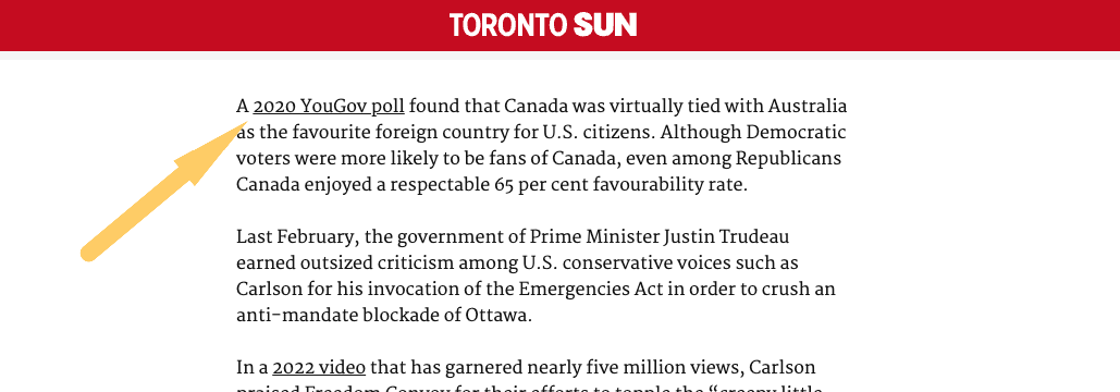
Operating in both the US and the UK, YouGov maintains its own panel of respondents, enabling it to gather information quickly and produce timely surveys that capitalize on trending topics.
For this post, I analyzed their current list of about 2,350 surveys and identified six main categories that can help drive your survey campaigns.
Notes on methodology: For this analysis, I excluded all content that wasn’t in article form (which removed several hundred surveys).
For everything that wasn’t categorized initially (which is all of business.yougov content) I manually assigned them to the existing categories that YouGov has already established using keywords in the title.
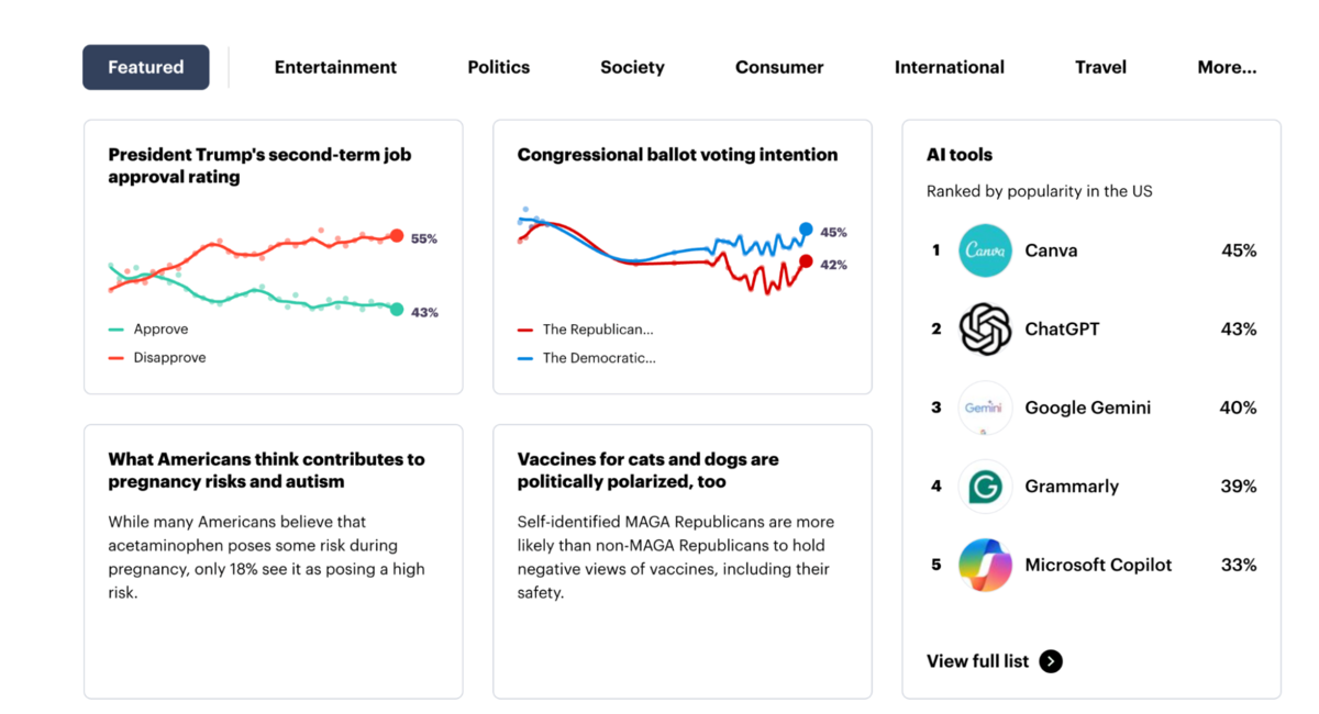
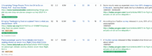
Top 25 Surveys by RD
First, here is a list of the top surveys based on the number of Referring Domains (RD) as per Ahrefs data:
Next, I went through the YouGov dataset and split their surveys into a few buckets based on some trends I was seeing:
- Most/Best vs other
- Timely vs evergreen
- Emotions
- Category (from YouGov blog)
Most/Best vs Other Breakdown
After combing through the surveys, it appeared to me that there were two distinct types of surveys – those that ranked, compared, or crowned a winner of some kind, and then everything else.
But, the full breakdown looked like this:
| Metric | Most/Best | Other |
|---|---|---|
| Number of posts | 475 | 1875 |
| Total links | 21,858 | 67,998 |
| Avg links/post | 🔥46 | 36.3 |
Although there were fewer Most/best posts overall, they tend to get about 10 more links on average per post.
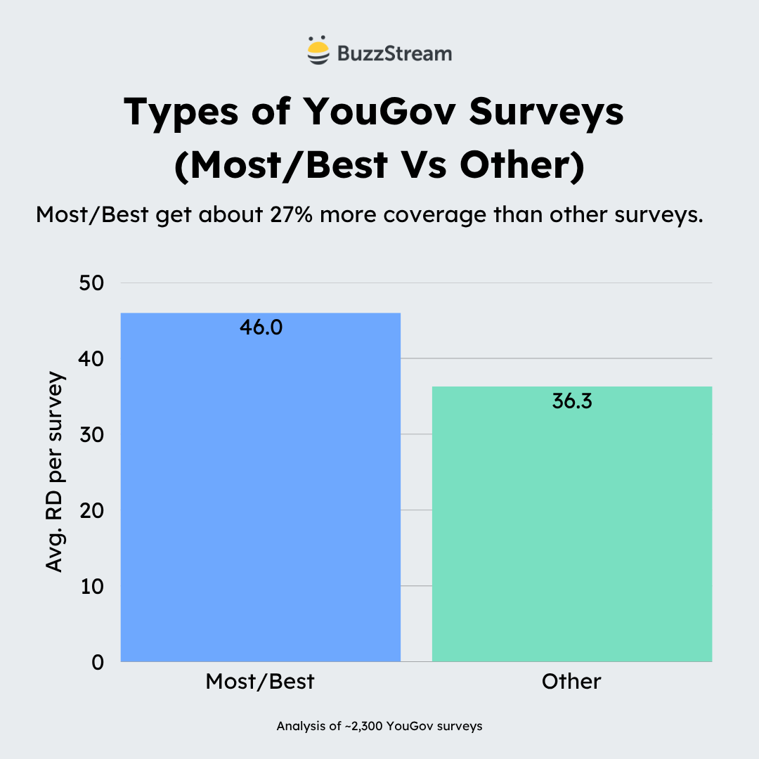
There are two reasons for this:
1. These most/best are the kinds of headlines that readers share.
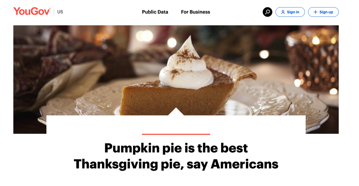
These lists tend to draw debate and conversation. For instance, my wife hates pumpkin pie, so I immediately sent YouGov’s survey on the best Thanksgiving pie 😈
2. These tie to some kind of keyword volume and get links over time as people search. (This is known as passive link building.)
For instance, here is a post on What countries do Americans like the most which has accrued 51 RD.
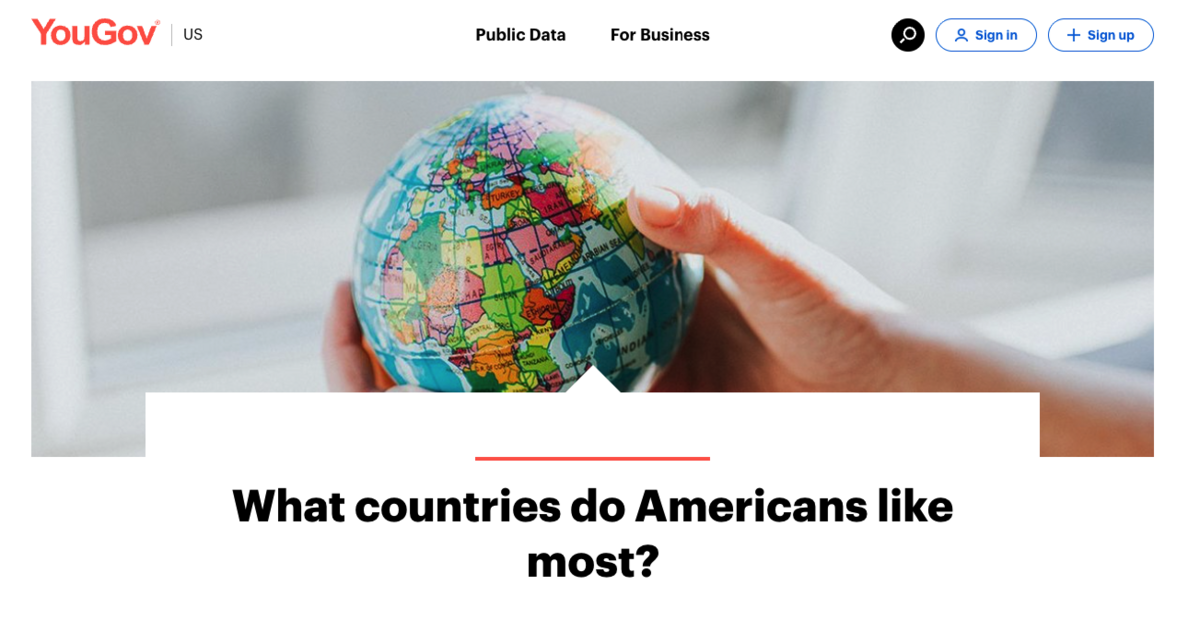
When you look at the search volume, you can see that it gets about 90 searches per month and YouGov ranks #1.
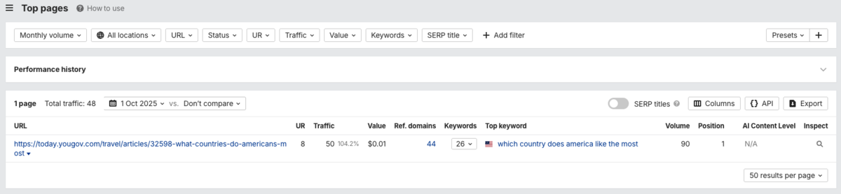
So, whenever researchers, journalists, or bloggers search for this keyword, they see YouGov, grab the stat, and cite it in the article.
Next, I noticed, as with the Thanksgiving pie survey, that some YouGov surveys leveraged trends.
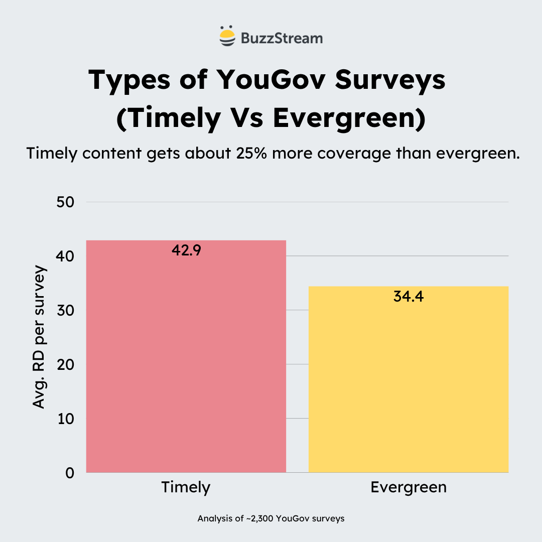
Timely vs Evergreen Breakdown
When you look at YouGov’s content, they fall into two flavors: timely hits vs evergreen staples.
The timely content includes topics such as elections, holidays, and other significant news events. Evergreen content is material that remains relevant and timeless, such as “America’s favorite sandwich.”
| Metric | Timely | Evergreen |
|---|---|---|
| Number of posts | 1,060 | 1,290 |
| Total links | 45,432 | 44,424 |
| Avg links/post | 🔥42.9 | 34.4 |
Overall, the timely posts got about eight more links on average.
I should note, however, that I based my analysis on a title analysis, so in some cases, even if the topic is evergreen, they position the content around a holiday in their write-up.
Either way, this highlights the value of newsjacking and reactive PR.
Journalists are more likely to share a study or survey if it relates to a current trend.
Though there is a give and take.
Typically, surveys that leverage news trends have a shorter life span.
Let’s take a look at what the link velocity looks like (or links gained over time) for a timely post vs an evergreen.
Here is a post leveraging breaking news.
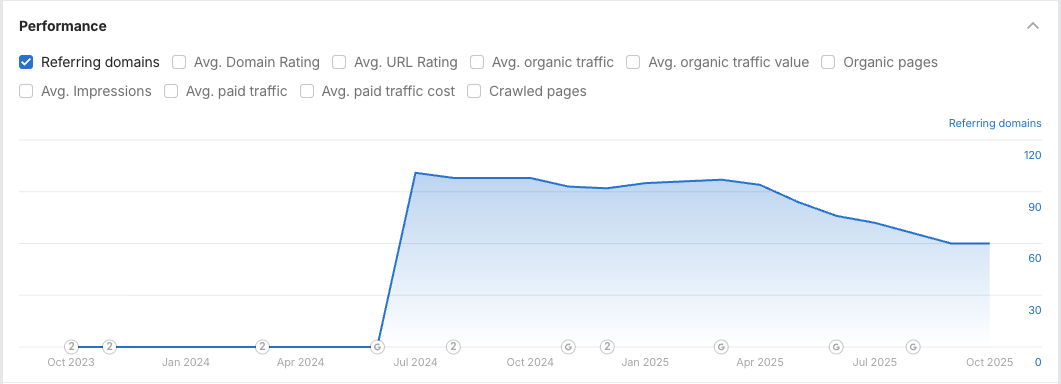
It has a shorter shelf life and will decrease (sometimes rapidly) over time:
An evergreen topic can look like this, with consistent growth over time:
These evergreen pieces are typically (but not always) kinds of surveys that tie to search volume, which we saw in the previous section (most/best surveys).
The mix for YouGov here is potent in that timely surveys feed the immediate news cycle, while evergreen surveys consistently get organic links and coverage over time.
Next, I want to get into the emotion, which I believe is absolutely key for every survey.
Emotion Breakdown
This breakdown was less straightforward. First, I had to come up with some core emotions and then try to fit all of the posts (even the evergreen ones) into emotion buckets.
This broke down into these five categories.
| Core Emotion | Posts | Avg RD | Total Links |
|---|---|---|---|
| Excitement / Joy | 378 | 🔥49.0 | 18,524 |
| Fear / Anxiety | 72 | 42.5 | 3,059 |
| Disgust / Disapproval | 16 | 40.1 | 641 |
| Curiosity / Surprise | 1,369 | 36.1 | 49,377 |
| Controversy / Anger | 515 | 35.4 | 18,255 |
To understand a bit more, here’s a bit of my methodology:
- Excitement/Joy has words like favorite, best, popular, enjoy, watch, and listen. These include fun lists, sporting events, and foods, among others.
- Curiosity/Surprise are more about the why, what, and how. These make the reader want to click.
- Controversy/Anger have social and political connotations, as seen in words like Trump, Biden, election, ban, and support. Everything that might feel combative.
- Fear/Anxiety has worry, risk, threat, fear, anxiety, recession—all of the stuff that causes unease.
- Disgust/Disapproval has bathroom, dirty, gross. These spark visceral reactions.
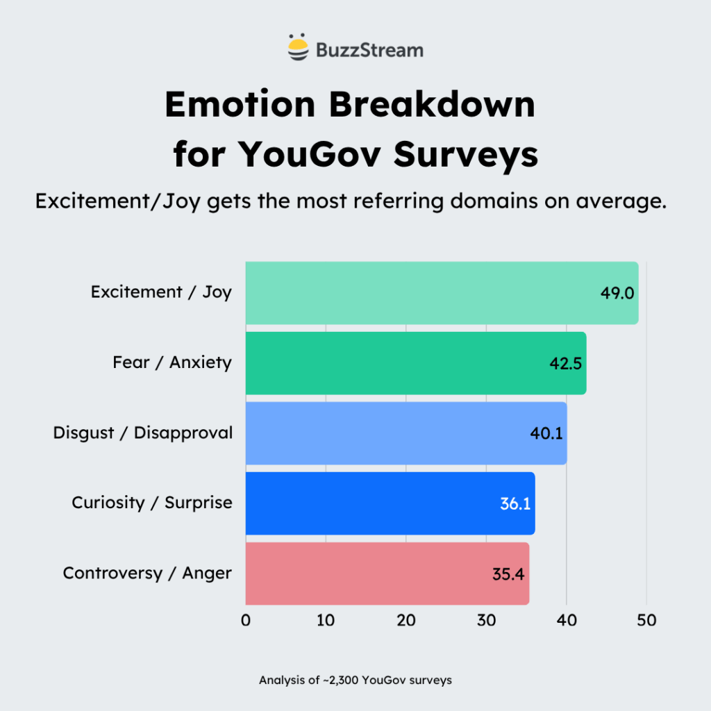
Excitement/Joy has the most links on average for a few reasons.
Those posts tended to feature listicles centered on topics such as food or sporting events. These were a lot of the evergreen topics I mentioned in the previous section.
Then, I based these emotions on keywords, but there is a TON of crossover happening. Most surveys draw out multiple emotions.
For instance, the Thanksgiving pie survey I mentioned earlier can bring joy and excitement about the holiday season, but it can also draw controversy.
Some surveys that are exciting for some cause anxiety for others.
So, the takeaway here is that all surveys need some kind of emotional trigger to help with shareability.
In the next section, I’ll point out how all of these play together.
Category Breakdown
Lastly, I would like to delve into the category breakdown. Most URLs have categories in them, except for the business.yougov content, which I’ve categorized manually.
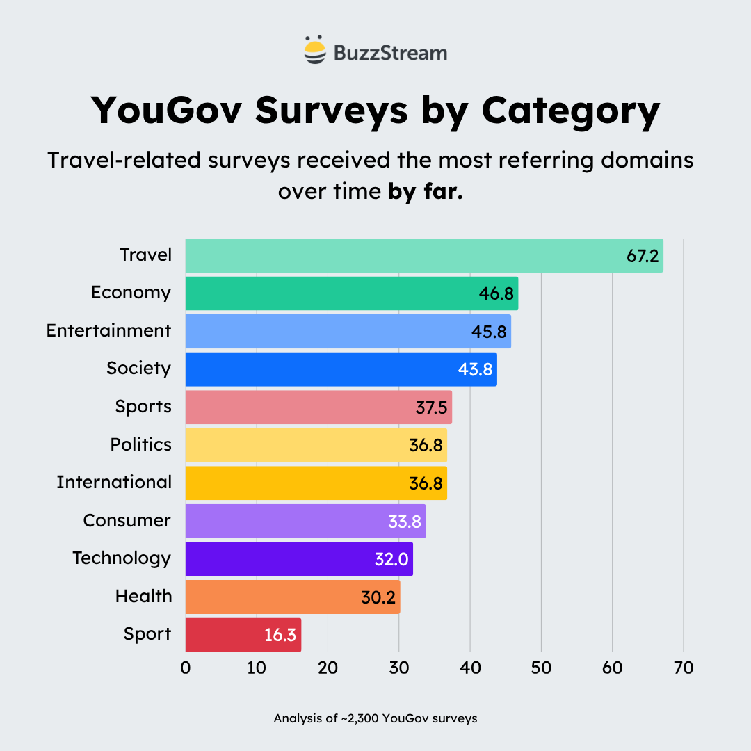
Overall, there are 11 categories.
| Categories | Posts | Avg RD | Total Links |
|---|---|---|---|
| Travel | 26 | 🔥67.2 | 1,747 |
| Economy | 63 | 46.8 | 2,951 |
| Entertainment | 122 | 45.8 | 5,590 |
| Society | 426 | 43.8 | 18,653 |
| Sports | 89 | 37.5 | 3,338 |
| Politics | 1,032 | 36.8 | 38,004 |
| International | 66 | 36.8 | 2,426 |
| Consumer | 261 | 33.8 | 8,833 |
| Technology | 199 | 32.0 | 6,360 |
| Health | 63 | 30.2 | 1,905 |
| Sport | 3 | 16.3 | 49 |
As you can see, politics topped the list for most posts and overall links, but travel got the most links on average.
Below, I attempted to give a further analysis of the top 6 categories based on the number of posts (and total links). I’ll discuss the construction of the surveys, as well as emotional ties, to help give you a sense of what makes an excellent survey.
1. Travel
Travel is somewhat of an outlier, given that it had only 26 posts, but it had the highest average RD count overall.
The ones that did well did really well on average.
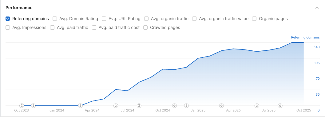
The top travel post, Adults under 30 are more likely than older Americans to have a current U.S. passport, got 411 RD.
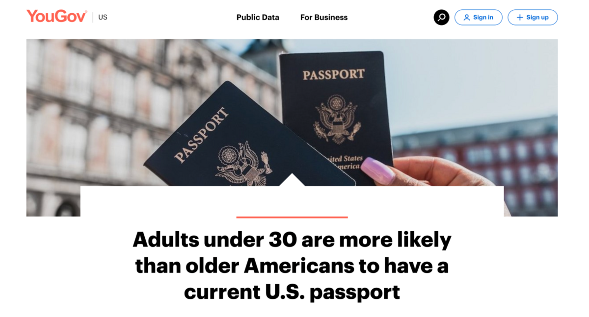
Here, they leaned into demographics like age, race, and education level:
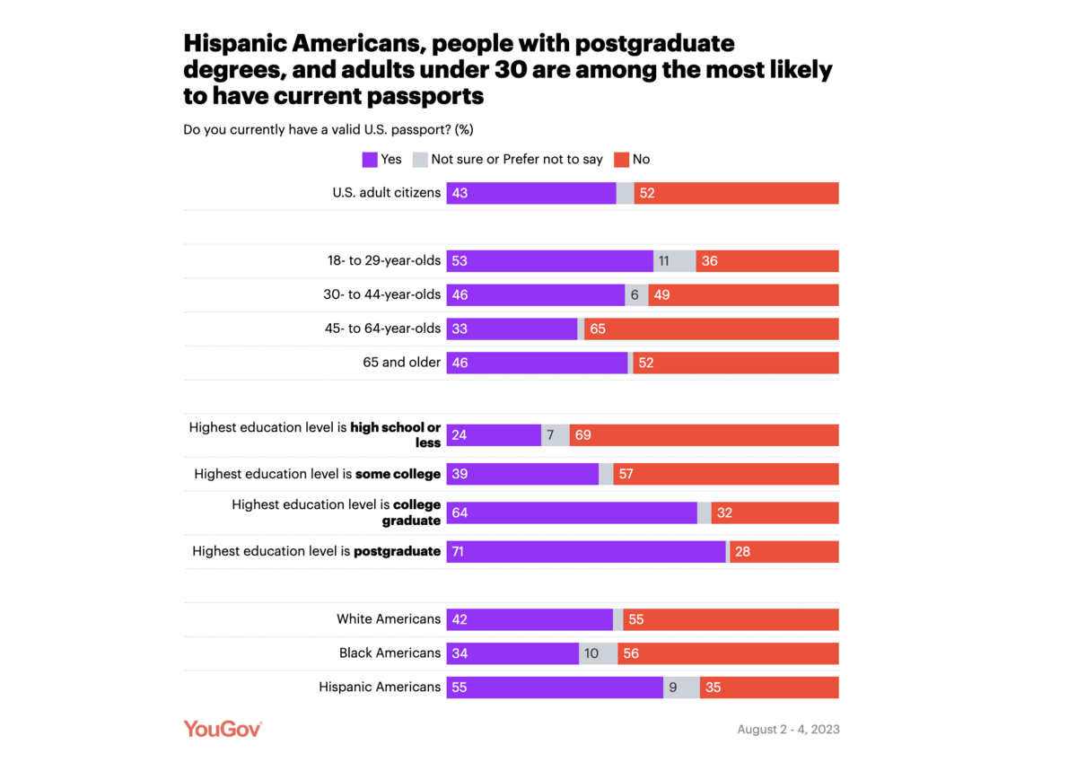
This is one of the few that I’ve seen that digs into race and education, which may be part of its success.
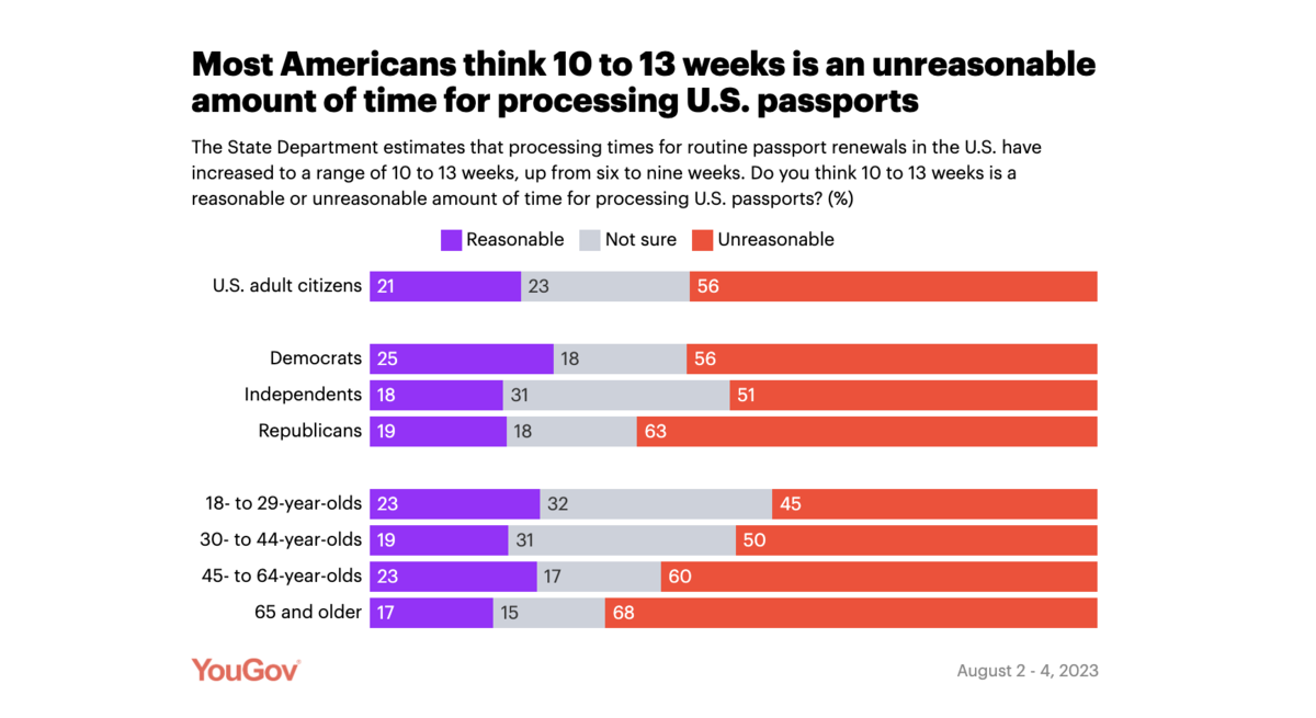
The survey also took a look at political leanings:
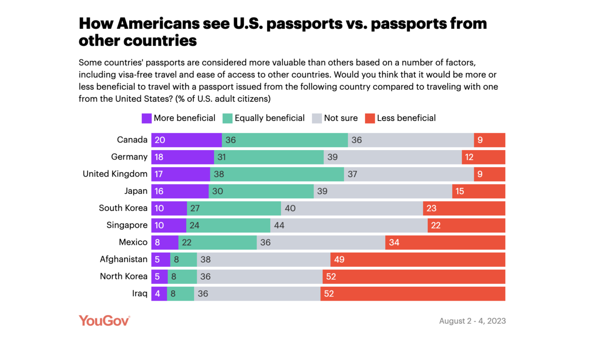
And how Americans see US passports from other countries:
When I started to dig into the kind of coverage it got, it seemed that this piece picked up a lot of coverage because of the SAVE Act, which deals with citizenship:
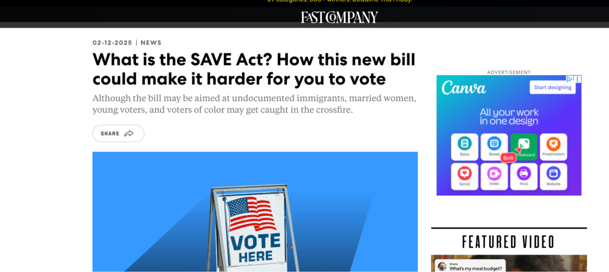
You can see it covered here as well:
Initially, this piece didn’t receive a lot of coverage, but it gained momentum as it progressed. But something as universal as a passport definitely lends itself to getting coverage. (Unsurprisingly, the third most-linked piece in the travel category was also about passports.)
In addition, numerous emotions are intertwined with this passport data, including national pride, traveler rights, and even stereotypes.
You can tell by looking at some of the articles in which it was mentioned:
Let’s take a look at the next most-linked piece, which is a lighter topic but again entirely universal: In-flight drama: Where Americans sit on airline etiquette
Here, YouGov leaned right into the controversy right in the question, where they are drilling down “unacceptable” behavior:
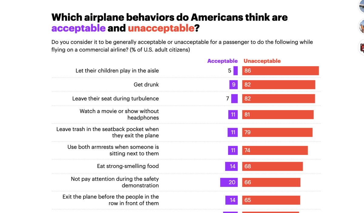
This was the only question they asked, and really all they needed to tell a good story.
And you can see from some of the coverage, it played really well:
It got coverage from NPR, Dailymail, and Business Insider.
2. Economy
The category with the following highest average number of links was also a small one.
Here, a significant outlier skewed the results.
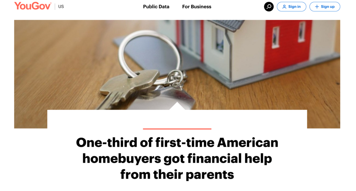
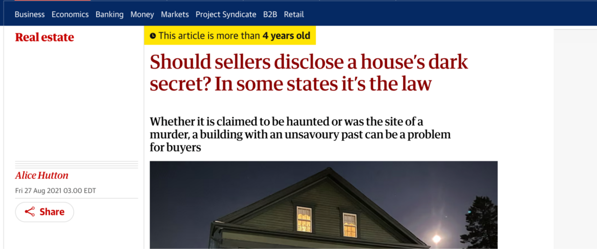
YouGov’s most-linked piece of all time was part of the economy category: One-third of first-time American homebuyers got financial help from their parents.
The poll only consists of one question: when it came to owning your first home, how, if at all, did your parents help financially?
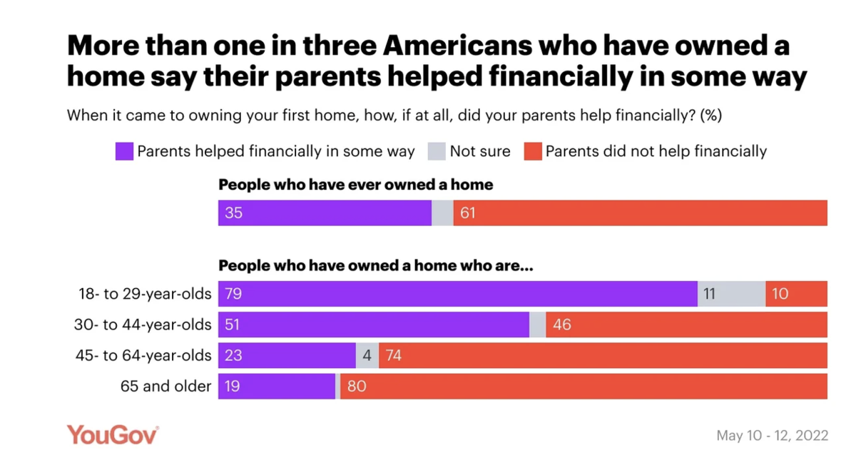
I believe the two reasons for this survey’s success stem from its timeliness and emotional appeal.
It was released May 25, 2022 amidst skyrocketing housing prices and mortgage rates in the US.
The single question also cleverly taps into emotions like frustration and anger felt by prospective home buyers without access to financial help (or even current homeowners who purchased on their own terms).
However, because housing prices have not stopped rising, this survey remains evergreen and you can still see links coming to the post.
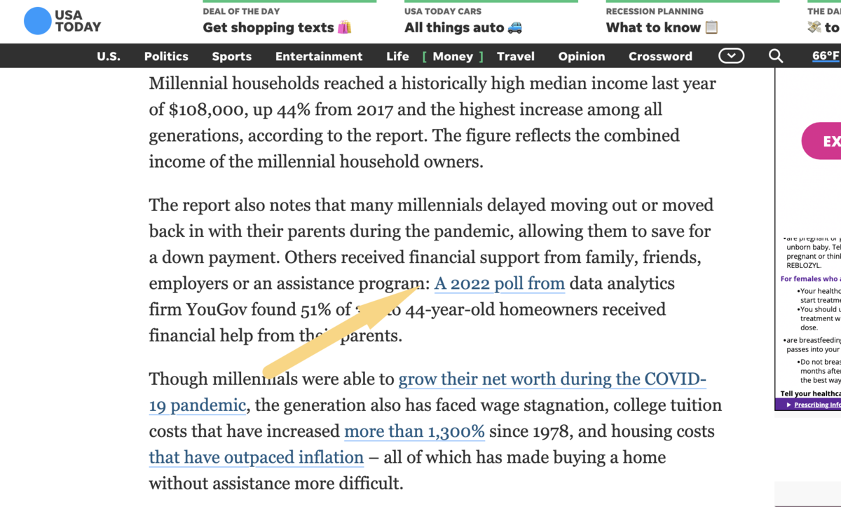
The above is a post from 2023 that still references the study.
3. Entertainment
The fourth-most linked category was entertainment/culture. These tap into celebrities, movies, TV, and other culture-related topics.
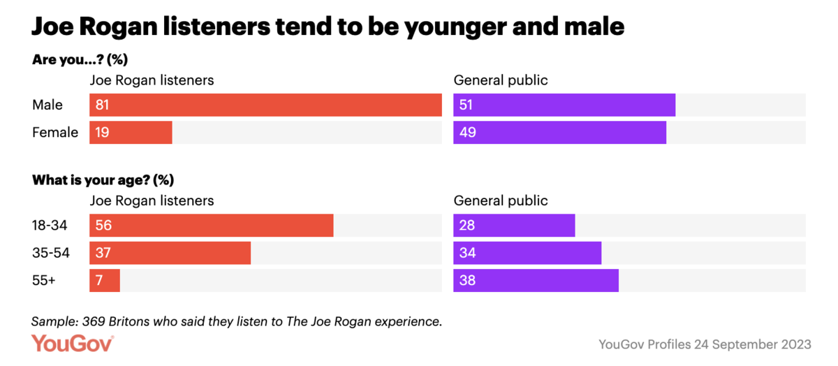
Their top survey in this category was Who’s listening to The Joe Rogan Experience? Men, mostly.
In it, they break down gender and age:
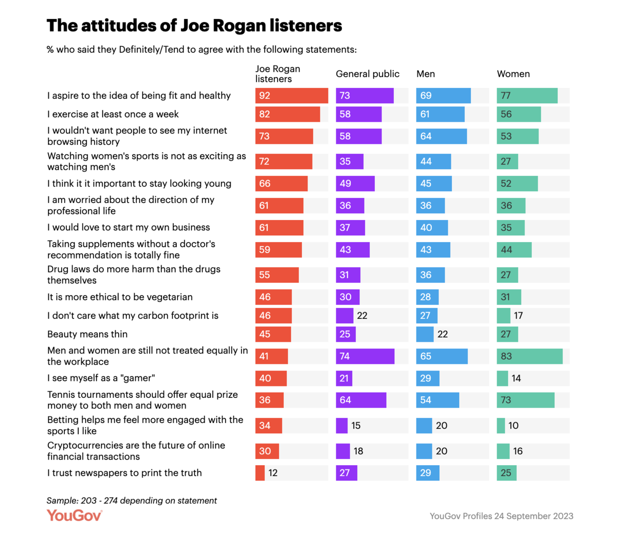
Followed by attitudes:
This type of survey falls more squarely into their consumer profile data offering, although it came on the heels of headlines that found Joe Rogan was the most popular podcast in the UK.
So, YouGov was clearly taking advantage of a trend here.
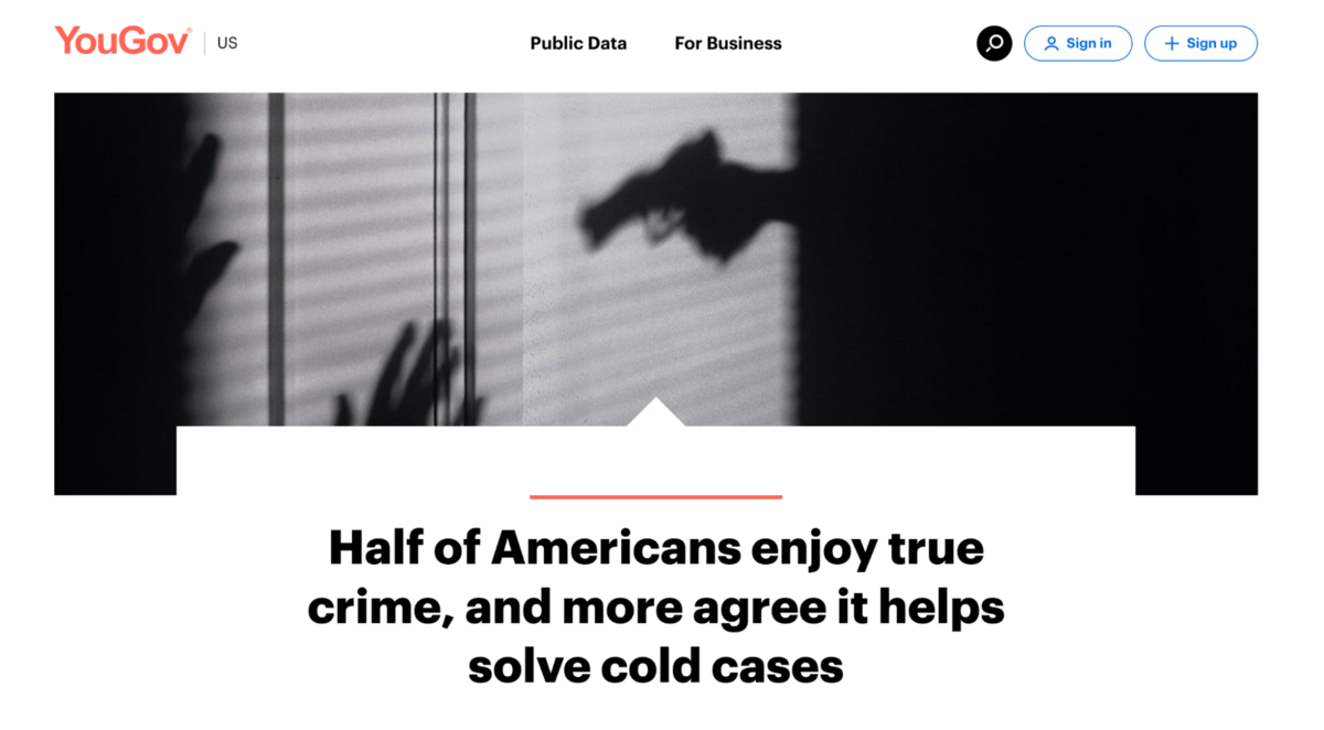
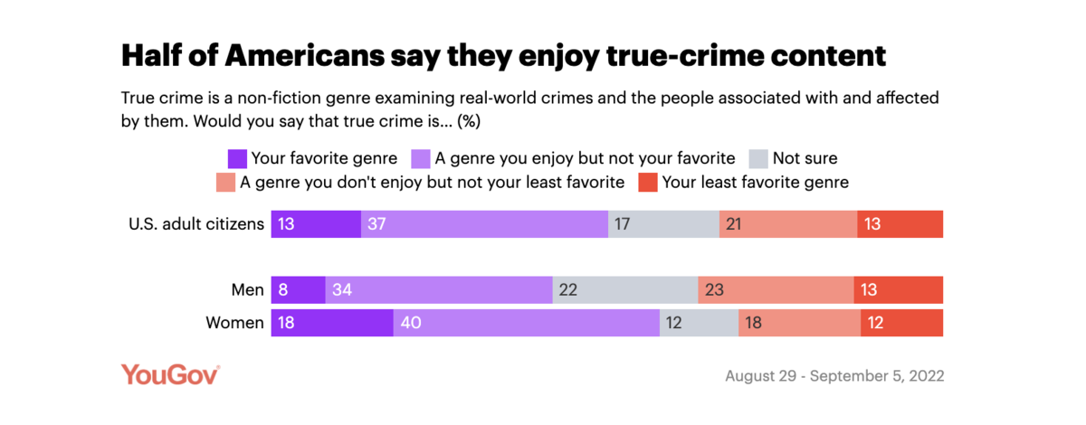
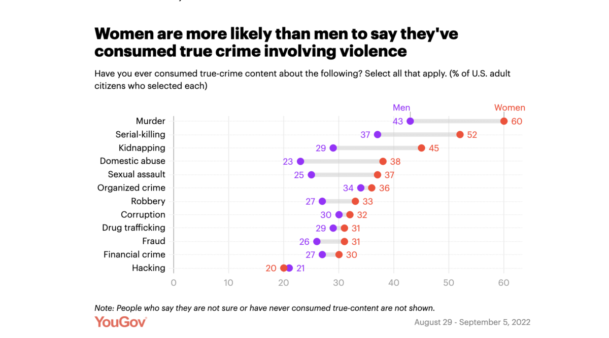
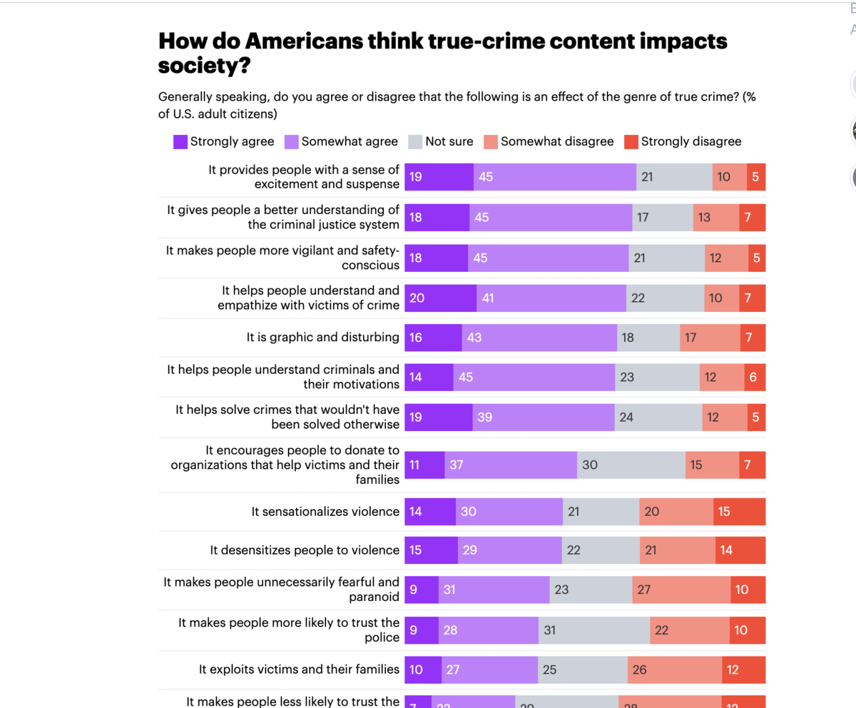
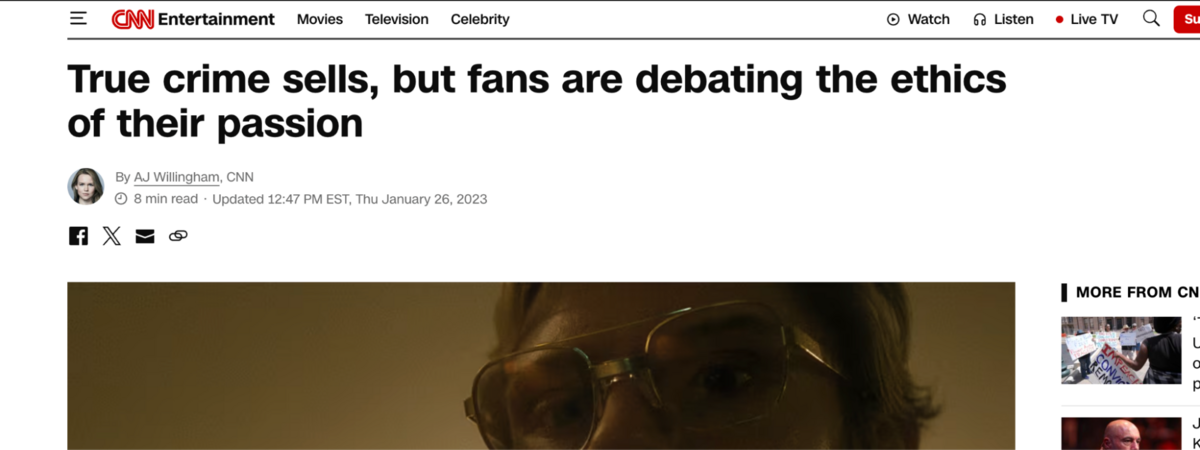
Here is a survey that capitalizes on the popularity of true crime: Half of Americans enjoy true crime, and more agree it helps solve cold cases.
Here, this was broken down into gender:
They drilled down even more into gender with a secondary question:
And then a third angle:
Followed by yet another gender breakdown:
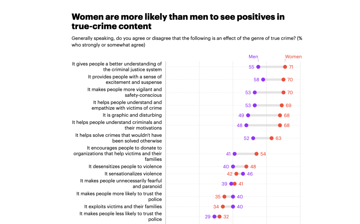
These gender angles seemed to really help tell the whole story of the product, but the takeaways from news sources were still mainly centered around the emotions that true crime shows elicit.
Here, YouGov got coverage within features on the controversial nature of true crime:
Here is one from Arizona State University:
It’s unclear if YouGov pitches these, but by providing data around a hot-button issue, they earn organic coverage.
Another, more entertainment-based survey that also had a timely slant was about Bachelor Nation, titled “What type of person is part of Bachelor Nation?”
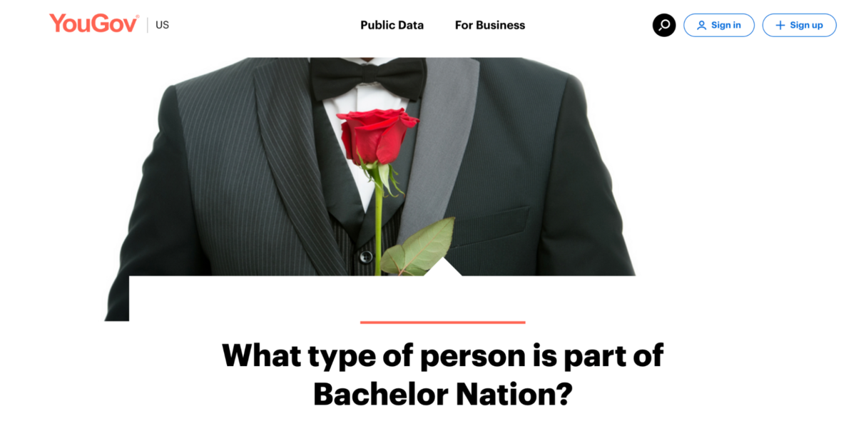
Here, because the content itself is more of a profile, they did look deeply into the ages:
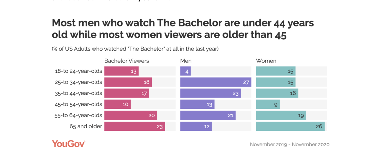
These age breakdowns seemed to be key coverage points once the Golden Bachelor rolled around several years later.
Here they are mentioned in a New York Times piece:
4. Society
These posts focus on societal issues, lifestyle choices, and feelings of identity.
The top performing survey, entitled Millennials are the loneliest generation really embodies the category:
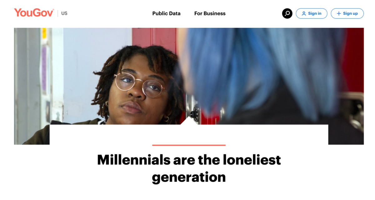
Created back in 2019, this post only focused on three of the main generations.
The emotional hook of being lonely is ingrained into the question itself: How often, if ever, do you feel lonely?
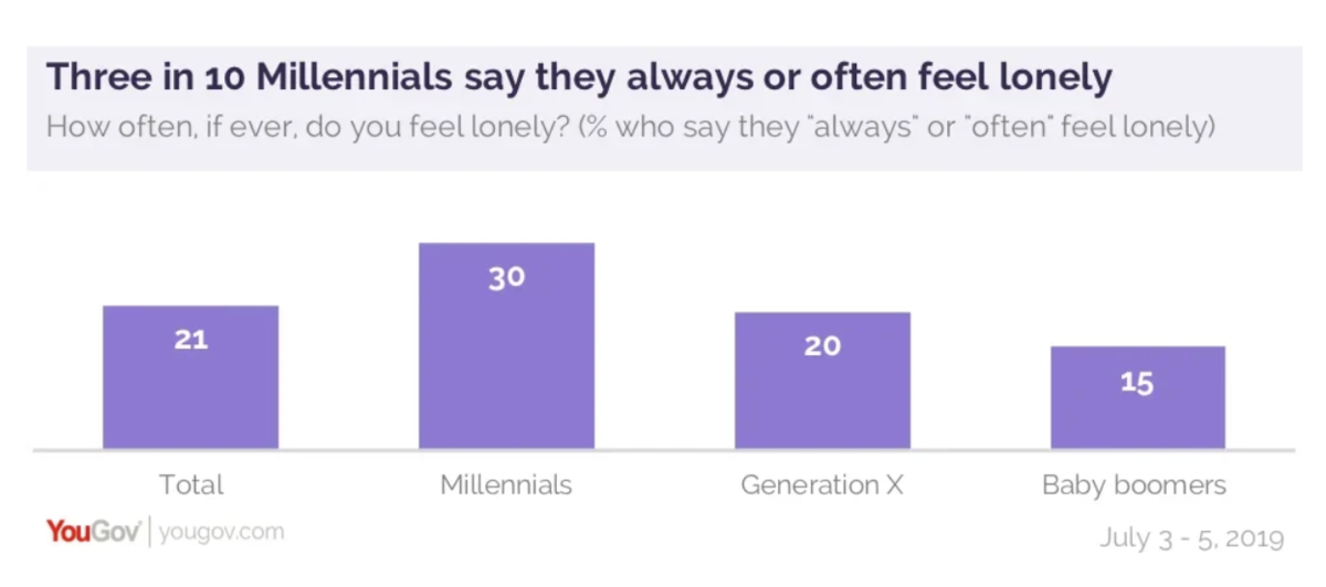
By applying a common emotion, it becomes instantly relatable to readers and thus more shareable.
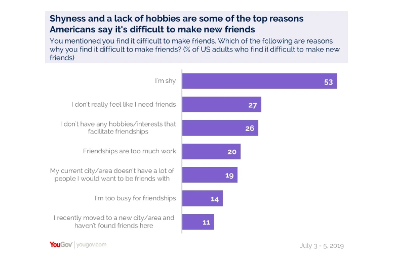
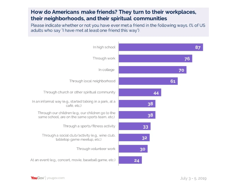
This survey is divided into several sections, each with subsequent questions. For instance, it dug into why it’s challenging to make new friends:
And where they make friends:
As I mentioned, most current YouGov surveys (except the large tentpole studies) appear to have abandoned the multi-question format and focus more narrowly.
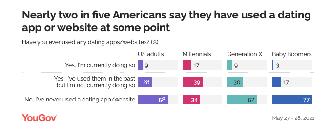
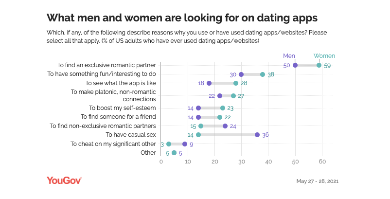
Another survey from this section was what are Americans looking for on dating apps?
This clearly leans into the emotion of love. In general, I’ve always found content about relationships to be fairly linkable.
These are broken down generationally:
And then, because relationship content does lend itself to gender angles, there is a gender breakdown:
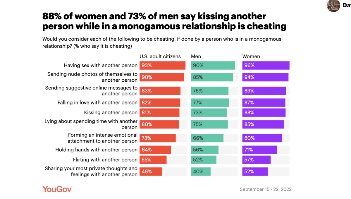
Here’s another relationship-based survey: How many Americans have cheated on their partners in monogamous relationships?
This one asks some really controversial questions that can easily draw out some strong emotions. And again, you clearly see the men vs women angle:
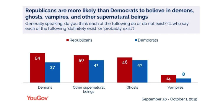
Here is another survey that carries a different kind of emotional hook, entitled, Many Americans believe ghosts and demons exist.
They do tie this to Halloween, but it does a good job of eliciting some emotions. For instance, look at how it was covered in Lifehacker:
There’s also curiosity:
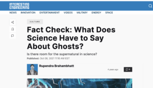
It’s also evergreen enough that it has received some organic pickups:
Interestingly, there was no age breakdown for this content. Yet, they did go with a political breakdown as a potential angle for coverage:
Here’s another significant survey that draws some interesting emotions: Many Americans don’t always wash their hands after using the bathroom.
Again, the timely hook here is that this was published during the 2020 flu season (before the COVID pandemic was in full blast).
Any content related to germs appears to perform well, as it has an inherent emotional hook of disgust built into the topic.
They did go one level deeper and asked about some consumer goods preferences:
Though based on their coverage, this angle wasn’t covered really at all.
5. Sports
The next category I’ll cover here is sports.
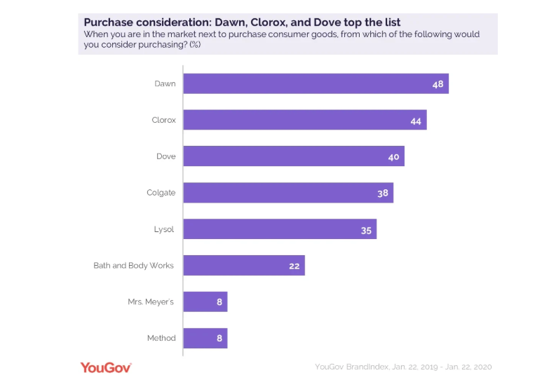
The first on the list is around March Madness: Americans say March Madness Final Four is one of top three most exciting sports events of the year.
The first question presented is an overall look at sports:
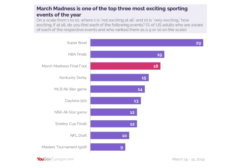
Then, of course, we have the age breakdown:
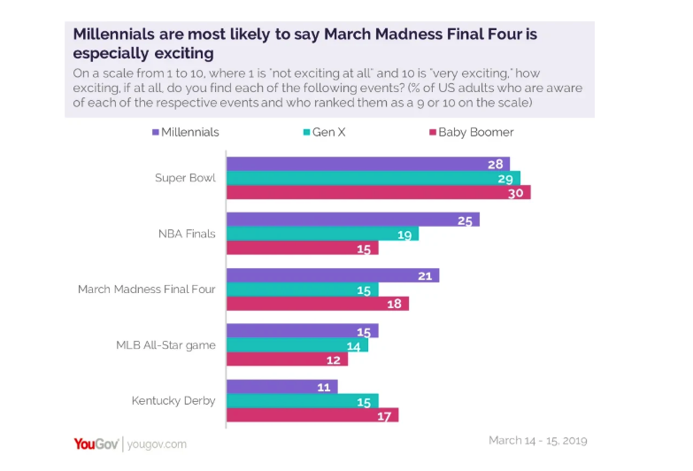
The emotion here is a clear one of excitement. People LOVE sports in the US—especially college sports.
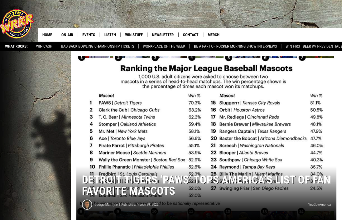
The next survey I wanted to highlight is the best Major League Baseball mascots, ranked by Americans.
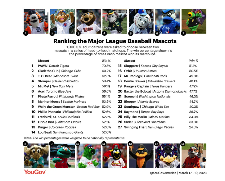
This was an extremely niche study that functioned almost like a city index study when I examined the coverage.
For instance, they were able to get on some general sports news sites, but mostly they got local coverage from areas that were in the top 10, like
Detroit’s WRKR:
As we’ve seen already, these types of most or best lists elicit emotions, especially from avid sports fans.
For instance, my personal take on this is that the survey is entirely flawed because Mr. Met beat out the Phillie Phanatic. As such, I’ve already shared my anger with several of my fellow Phillies fans and ranted about this on social media.
6. Politics
YouGov’s strongest category, from a total links and total posts standpoint, is politics.
They’ve generated over 38,000 RD from 1,032 surveys.
Most of these capture something within the current zeitgeist or media coverage, making them easy to share because they are top of mind.
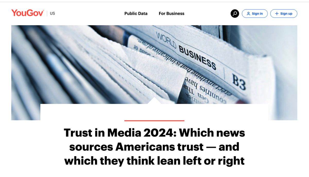
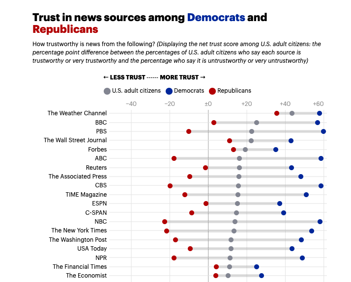
The top example is Trust in Media 2024: Which news sources Americans trust — and which they think lean left or right.
Here they provide a comprehensive analysis of all media sites and asked Americans for their net trust.
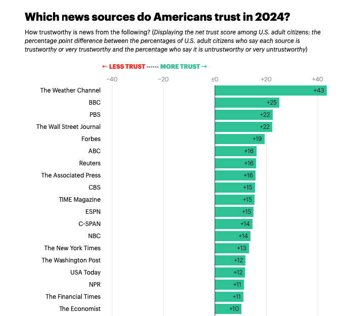
Then, they of course broke it down by political leaning:
The post goes on to look at liberal and conservative takes, some age breakdowns of media types:
This is very much a deep dive, in the same vein that Pew Research takes, which is actually much deeper than a lot of the content on YouGov.
The “Trust In Media” study is actually something they release every year, and clearly, the deeper they dug, the more links they were able to establish.
The following example has almost as many links and doesn’t go nearly as deep.
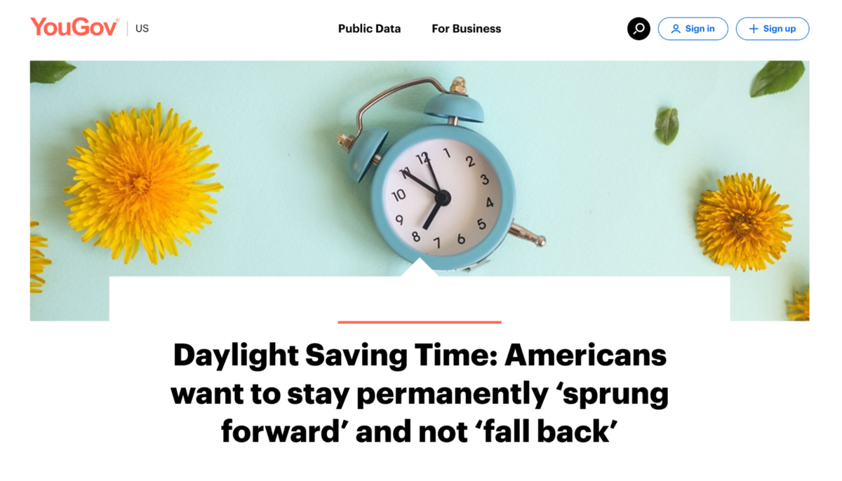
Another example is Daylight Saving Time: Americans want to stay permanently ‘sprung forward’ and not ‘fall back’.
In this case, there were only two questions.
First on the elimination:
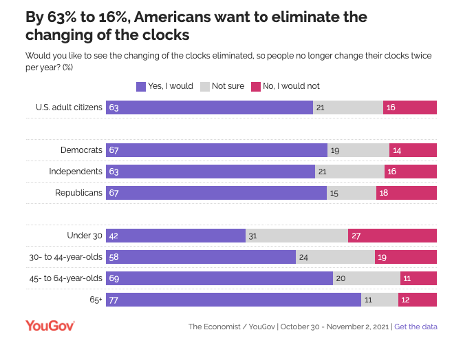
Then, on how deeply they want it eliminated.
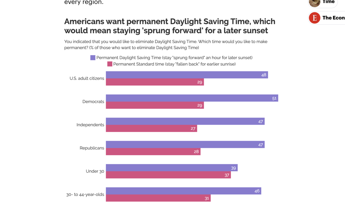
The fact that this was tied to a major recurring event gave it some inherent coverage. Then, layer on the trending politicization of the topic, and it could lean on the breaking/reactive side as well.
Another survey that received a lot of coverage is Two in five Americans say a civil war is at least somewhat likely in the next decade.
The survey topic was frequently discussed in the media around that time in the US.
This survey is another that has some extra emotional layers, such as fear or anxiety, and was clearly effective, as it was the sixth most-linked survey on YouGov.
Since this was already politically charged, they built that into the survey breakdown:
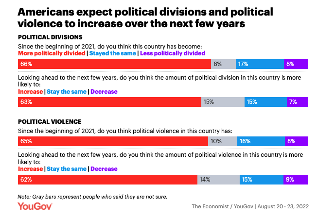
Interestingly, there was no age coverage on this one.
7. Consumer
I’m skipping international because, even though they are categorized as such by YouGov, the grouping is comprised of some of their earliest surveys and encompasses multiple categories.
(Plus, consumer has a lot more insights. 🤓)
These surveys are mostly tied to some form of consumerism.
They are typically surveys on popular brands or products, but for the most part, they still have some kind of timeliness.
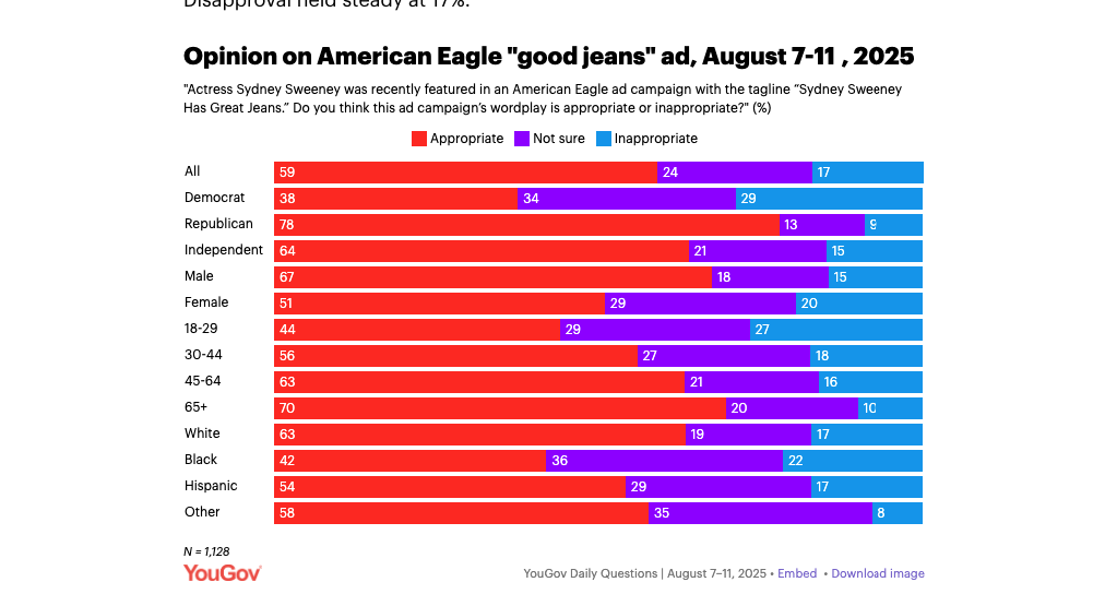
Some are very timely, such as one of their most popular surveys in this category, where American Eagle’s Sweeney ad splits opinion.
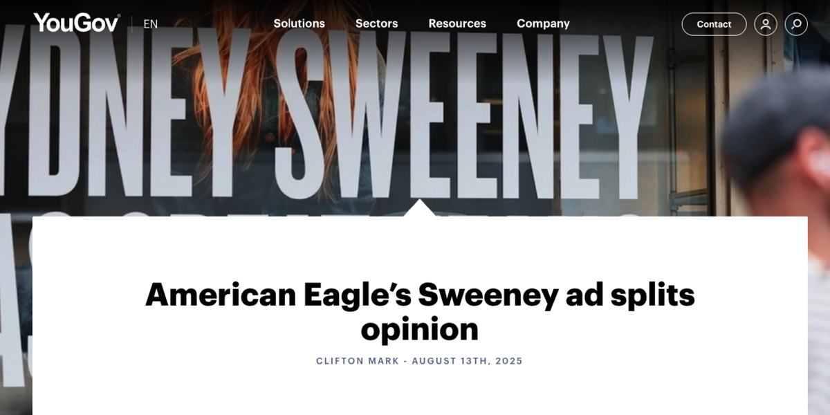
(For those unaware, this ties into a Sydney Sweeney’s American Eagle ad that was very controversial when it launched.)
Clearly, there is some emotion charged into this one, as it has become very politicized.
You can see that it took the full demo breakdown of political leanings, age, and even race.
But, others are a bit more evergreen consumerism angles, like America’s Favorite Sandwich:
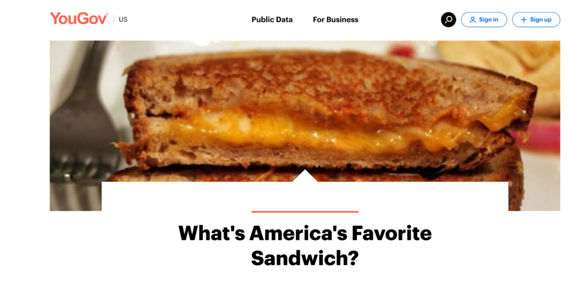
These tap into everyday products that users engage with frequently, making them somewhat evergreen.
What is missing from these is a clear emotional hook. However, if you look closer, it is there.
For instance, America’s favorite sandwich also has the other side, which is the most hated.
This type of content can easily spark drama in the office.
The presentation is also worth mentioning.
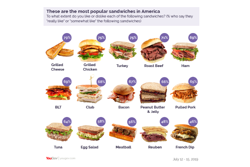
Although this is something very 2019-esque, I love it when a data visualization actually visualizes the thing they are presenting.
(It reminds me of an all-time favorite survey piece from Porch—via Fractl—called ‘Food Fights’, which took common arguments about food and weaponized them into an incredibly shareable survey.
If you haven’t checked it out, I definitely recommend it. Back to YouGov…)
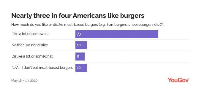
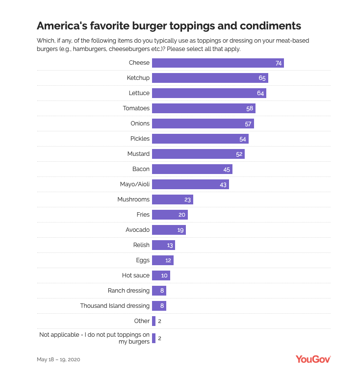
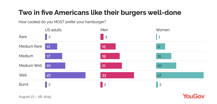
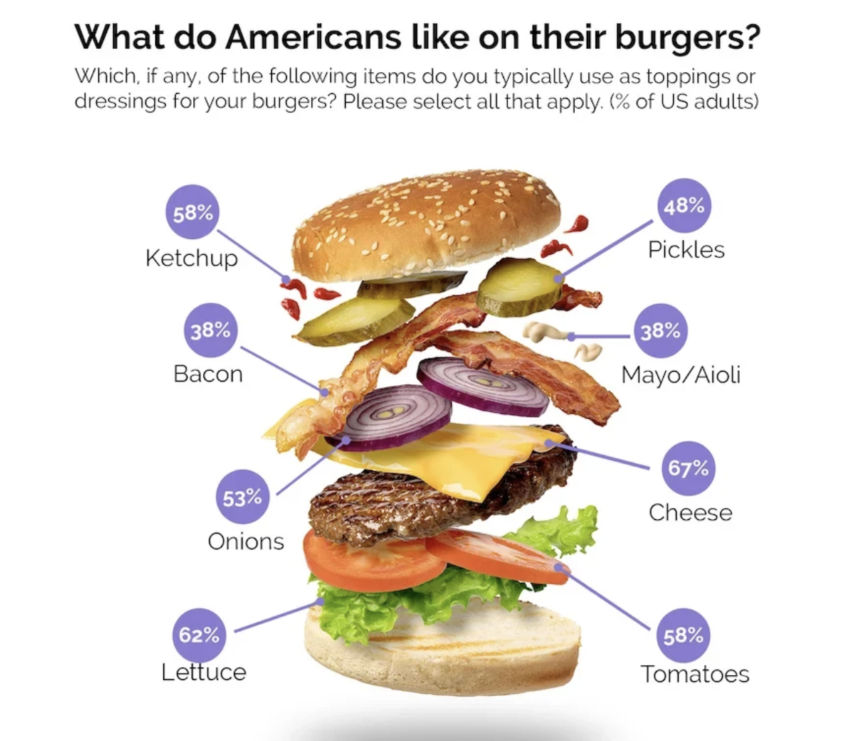
Here is another entitled Which toppings make America’s favorite burger?
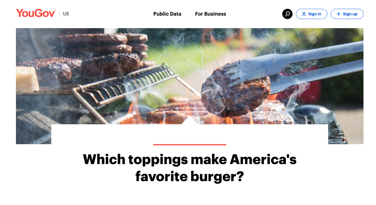
The survey breakdown asked a few questions, first establishing if burgers are liked:
Then the toppings:
Then, how they are cooked:
Again, when you look at the coverage, this kind of “best” vs “worst” is very popular (especially on radio stations, apparently).
Another survey, The unwritten rules of eating out: What Americans think about restaurant etiquette, virtually writes the emotional hook right into the questions.
As you can see below, they clearly distinguish between acceptable and unacceptable behavior.
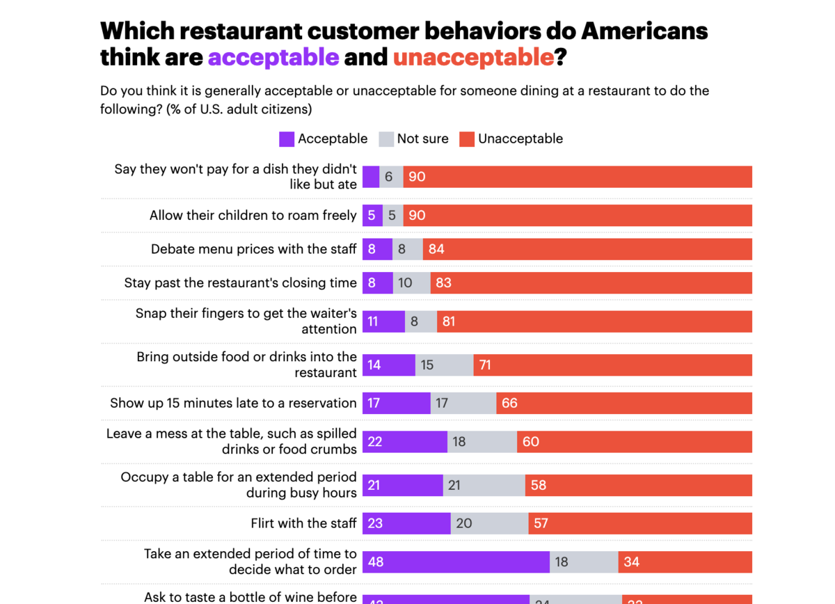
These are things that can clearly draw the ire of anyone who has eaten out, such as not paying for a dish but still eating it all. (As a former server at a restaurant, I concur that this is the most frustrating thing ever.)
Perhaps because the survey question is so strongly emotionally charged, they didn’t go with the age breakdown.
In all of these instances, another factor contributing to their success is that they’ve also gained links over time, as they are evergreen topics.
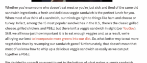
For instance, in a post entitled Expert Tips for Making Your Veggie Sandwich Shine, from Mashed, they mention the YouGov survey in passing (rather than the entire piece being a feature about the survey).
This kind of organic pickup is widespread amongst this set of surveys.
What Can We Learn
Based on these few thousand surveys, here are my takeaways that digital PRs should be able to bring into their workflows.
1. Always have a timely angle
Almost 50% of the content features a timely angle built into the headline. And about 59% of the surveys on YouGov were politically charged, which isn’t always suitable for every brand (nor should it be).
That still leaves almost 40% of the surveys that clearly leaned into timely angles, like:
- “AI doomsday worries many Americans. So does apocalyptic climate change”
- “It’s a Wonderful Life and A Christmas Story tie for America’s favorite Christmas movie”
- “Half of Singaporean gamers gaming more in a COVID world”
Some aren’t timely on the surface, but can tie into events, like “About half of Americans believe ghosts and demons exist”, which has a Halloween-timely hook.
When creating a content calendar, begin by identifying relevant events within your niche.
These can include social media days, such as National Taco Day, holidays like Thanksgiving, or industry-specific recurring events like the World Cup, Apple’s WWDC, or the Federal Reserve’s FOMC Meetings in the US.
Brands should then also monitor major trending news events (and anniversaries of such events) to inform their survey data.
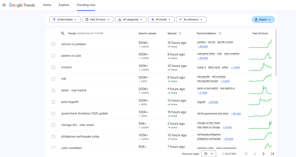
A tool like Google Trends can help uncover trending topics:
Not every survey can connect to a trend. Read more about it in our newsjacking guide.
2. But don’t sleep on evergreen topics
Most evergreen topics can generate links over time, especially when tied to highly searched keywords with high intent to link. (Yes. Keywords are still a thing.)
Surveys that crown a winner (best mascot, most admired woman, favorite sandwich) average 10 more links per post than everything else.
The secret to this is authority.
A brand can’t come out of nowhere and expect to get cited in AI and news publications.
It needs a solid methodology, a proper survey sample size, and some insights from experts in the field.
However, it also needs to establish trust in the industry through routine surveys, which will help demonstrate that it is a consistent and trustworthy source of information.
We saw that YouGov has been successful with their yearly surveys, such as their Trust in Media reports.
They’ve also leveraged this established authority to build digests, intelligence reports, ratings, and trackers.
![]()
But you need to walk before you can run.
3. Always have an emotional tie
All of the content on YouGov has some emotional tie. Some are more obvious than others, like “The holiday stress gap: Is the festive season more stressful for women than men?”
The emotions I covered were
- Excitement/Joy
- Curiosity/Surprise
- Controversy/Anger
- Fear/Anxiety
- Disgust/Disapproval
Excitement/Joy and Curiosity/Surprise outperformed for YouGov on average because they’re fun, quirky, and easy to share.
Controversy/Anger and Fear/Anxiety generated huge totals by sheer volume.
Even niche Disgust/Disapproval (bathroom habits, hygiene) works because of its visceral hook.
But there are so many others.
One of my go-to resources for survey content has always been Kelsey Libert’s post from Fractl on the Role of Emotions in Viral Content.
She shared this image, which helps show the wheel of emotions:
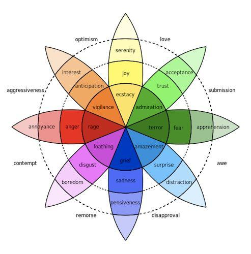
Pick, choose, combine.
4. Use age, gender, and politics to expand reach
The three primary demographics to make sure you always capture are gender, age, and political leaning.
With those at your fingertips, you can always turn surveys into stories driven by generational divides, gender gaps, and politicized arguments.
You shouldn’t be out there forcing a story, but remember, the idea is to elicit an emotion.
For instance, you won’t find political leanings (or gender or age) on American’s burger preferences:
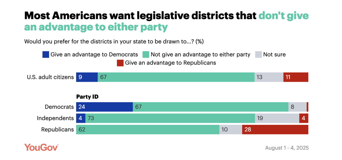
But legislative districting certainly calls for it:
Use the trending news as a guide.
These divides can drive home a point and turn a survey from an interesting one into a fiery one.
5. You may need fewer questions than you think
YouGov’s sweet spot is single-question polls with a precise angle, often followed by a breakdown (age, gender, political affiliation). This format makes the story instantly scannable and headline-friendly for journalists.
However, there is an aspect to this where YouGov’s authority lets them get away with a bit more.
I don’t recommend slicing your surveys down to just single questions, but 3-5 questions can sometimes give you enough information for a compelling story (as long as you are capturing the aforementioned demographic data).
And, as we’ve seen, specific topics warrant more in-depth examination, such as YouGov’s investigation into AI concerns, which had eight questions.
You need to make sure you are bringing new information to the table.
6. Consider building relationships with newsletters
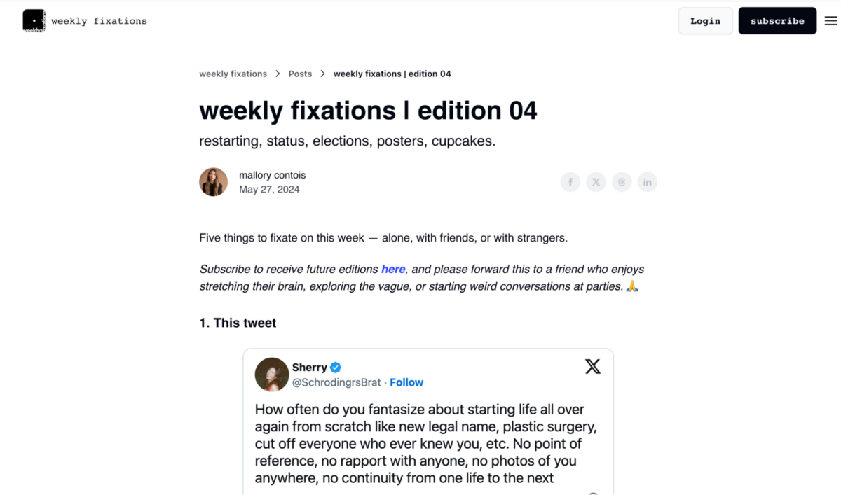
One thing I noticed in analyzing a lot of the coverage was that YouGov was often cited in newsletters, like Substack.
Here is a personal newsletter called Weekly Fixations, where I found a YouGov study linked:
These kinds of newsletters provide a great source of content distribution.
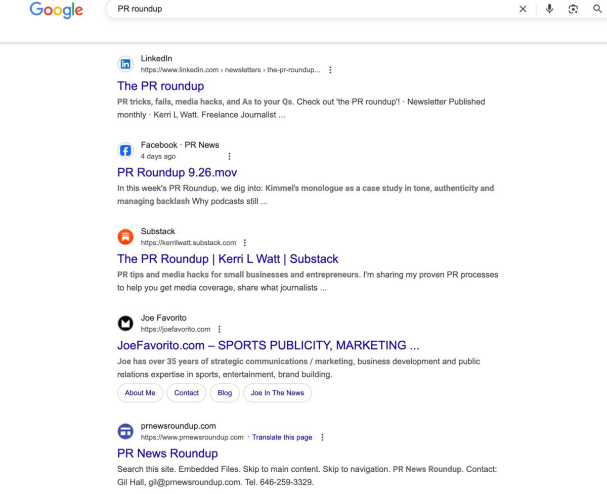
Simply search for keywords like your “industry + newsletter” or “link roundup” or “monthly roundup”.
Building relationships with these kinds of newsletters means doing the work to subscribe and engage with their content before simply asking for a link.
7. Pitch to the right journalists, not all journalists
Although we don’t know if YouGov pitches this content to journalists, at this point, it’s unlikely, given that they are an established data entity (except perhaps for their annual reports).
However, we don’t all have that luxury. Most brands need to pitch to get coverage.
But blasting out a press release to thousands of journalists won’t get you anywhere these days. Even the general lists that you get from media databases can cast too broad a net.
We conducted a study that found smaller, more targeted campaigns vastly outperformed large, generic blasts.
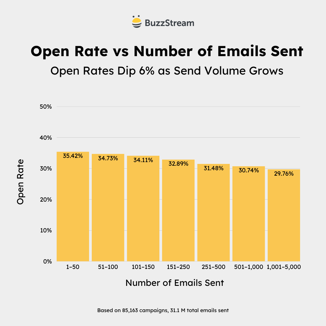
Most brands need to go out and build hyper-targeted media lists because every journalist covers third-party data studies.
Finding them involves reviewing recent articles, reading bios, and other information about each author on your list.
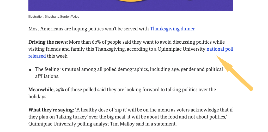
For example, say I’m trying to find a journalist who covers third party surveys about thanksgiving pie. I may want to search Google News with a search query like intitle:“most americans” thanksgiving.
This should uncover articles written in the same format as what I want to cover.
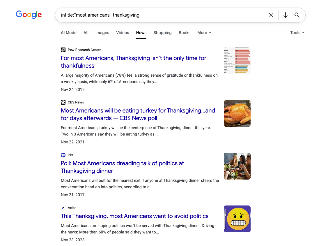
Typically, I’d have to go through each result and research down to see if the journalist (and publisher) is a fit for my survey.
I’d probably skip Pew (since they produce their own surveys) and CBS News (they mention in their article title that it’s a CBS News poll, so they likely wouldn’t be open to sharing mine.)
So, I’d open the Axios report to start my journalist list building process:
And it is indeed a third-party study:
However, I now need to locate the author’s bio.
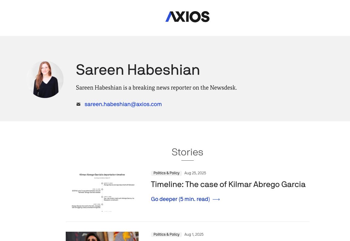
She appears to be a breaking news reporter, which doesn’t feel like a fit.
Let’s look at some recent articles to see what she’s covering these days.
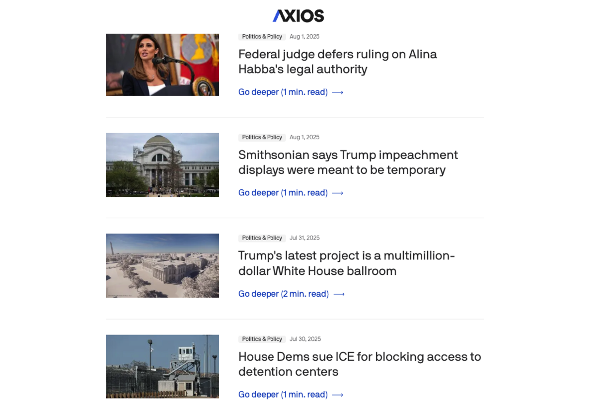
It feels like all politics and policy. So, my post would need a political slant to really fit in her wheelhouse.
Then, I’d want to dig around in her social channels and find her email address.
Typically, this can take ~10 minutes for a single journalist.
Building Media Lists for Survey Posts with ListIQ
With ListIQ, I can complete this research process for 100 journalists in the same amount of time it takes me to research one journalist manually.
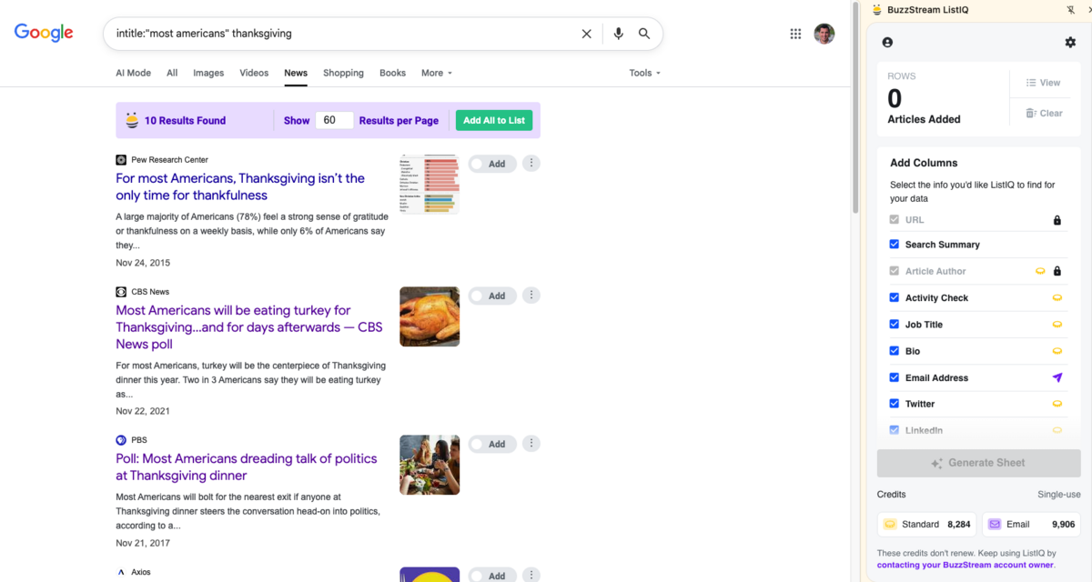
I’d enable ListIQ within my Google News search.
Then I’d tell ListIQ which articles I’d like to evaluate. I’d deselect Pew and CBS News because we are avoiding them.
Then, on the right side, I’d tell ListIQ what information I’d like to find out about the journalists covering my selected articles, like their job title, bio, email address, and so on.
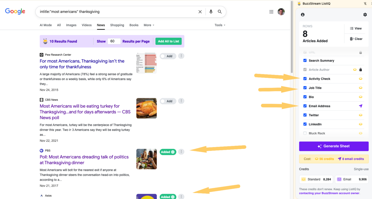
In under a minute, I’m provided with a Google Sheet of all of the author information for each article selected:
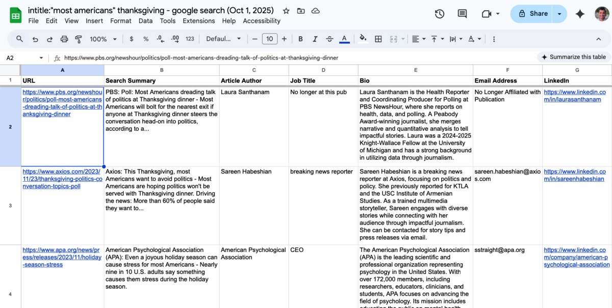
Now I can quickly see who is relevant for a survey based on information like their bio, recent articles, LinkedIn profiles and other fields.
However, I also have some information about authors who are no longer at the publications, which allows me to exclude some from consideration.
All of this took me minutes instead of hours and can drastically improve campaign accuracy, resulting in more links over time.
Start for Free
 Check out the BuzzStream Podcast