Table of Contents
- Front-load everything — all platforms pull 82-87% of summary content from the first half of your email.
- Keep it simple — longer, complex emails are more likely to have critical information dropped from summaries.
- Use bullet points — they’re the most reliable formatting tool, influencing summaries at least 64% of the time across all platforms.
- Subject line keywords matter — words like “new,” “data,” and the expert’s position are consistently pulled into summaries.
- Double-check published coverage — AI misrepresents data roughly one in three times across all platforms.
As AI continues to work its way into every workflow in digital PR, email inboxes are not immune. Microsoft, Apple, and Gmail have all announced built-in email summarization features.
Each is powered by the parent platform’s proprietary AI system, so Gemini powers Gmail, Copilot powers Microsoft Outlook summaries, and Apple Intelligence powers Apple Mail.
These email summaries can make it easier to take action upon and make an inbox easier to maintain in general. If you’re unfamiliar, here’s one from Gemini:

But there are some repercussions in the digital PR, link building, and general email outreach realm.
If an email gets rewritten by AI, is it still conveying the messages you want to convey? Do subject lines influence summaries? Will it include links? What about bullet points?
We worked with the digital PR team at Aira to analyze 628 emails across the three main email platforms to understand how AI-generated email summaries vary across platforms and how they might affect how your pitch is portrayed to the press. (Jump to methodology.)
Here’s a quick video recap:

Let’s get into it:
1. Which Platform Produces the Longest AI-Generated Email Summaries?
Microsoft Copilot produces the longest summaries (avg 156.5 words). Gmail/Gemini produces the shortest (avg 28.8 words).
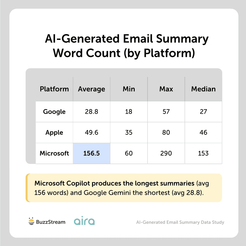
As you can see, each platform behaves differently, providing radically different “summaries.”
For example, here are two summaries of the same template from Apple Intelligence vs Gemini:
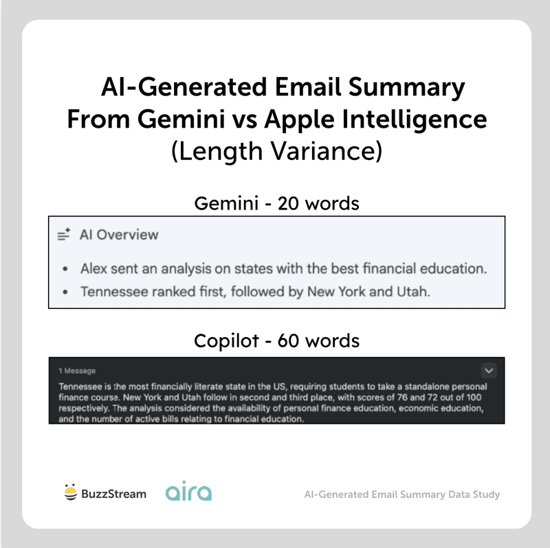
However, AI-generated email summaries are not repeated identically every time.
So, let’s look at the variations in summary length per platform next.
2. How Much Do AI-Generated Email Summaries Vary in Length for Each Platform?
Microsoft Copilot shows the highest variability in summary length when the same email template is sent to different recipients.
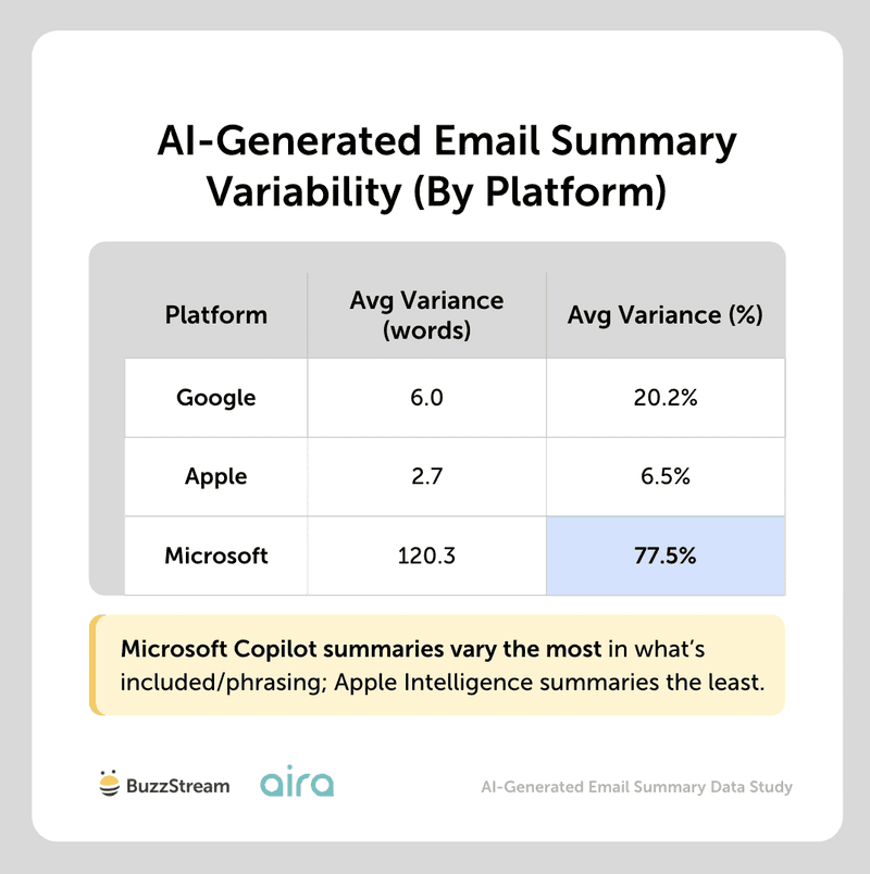
Apple Intelligence is remarkably consistent, producing identical or near-identical summary lengths 64% of the time. Google falls in between.
For instance, for the same email, Microsoft Copilot returned a summary of 290 words to one recipient but just 87 words to another; 251 to one recipient, 60 to another.
This inconsistency has been widely reported in AI search results, so it’s not surprising to see it here, given the same technologies.
Next, let’s look at the kind of information generated by AI summaries, starting specifically with where it pulls information from.
3. Does Info Earlier in an Email Appear More Frequently in the Email AI-Generated Summary?
Content from the first half of emails appears more frequently in summaries across all platforms.
Google Gemini had the most information coming from earlier in the email at 87.1%, followed by Apple at 82.5%.
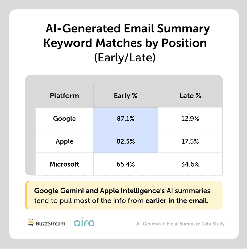
Microsoft was a little more spread out, with 65.4% of the keyword matches from earlier in the email.
As an alternate look, we also split each email into three sections: the beginning (first 2 paragraphs), the middle, and the end (last 2 paragraphs). Then looked at keyword matches in each section of the summaries and calculated percentages.
As you can see, this confirms that AI-generated email summaries tend to cite information from the beginning of the email, and that Google and Apple do this more than Microsoft:
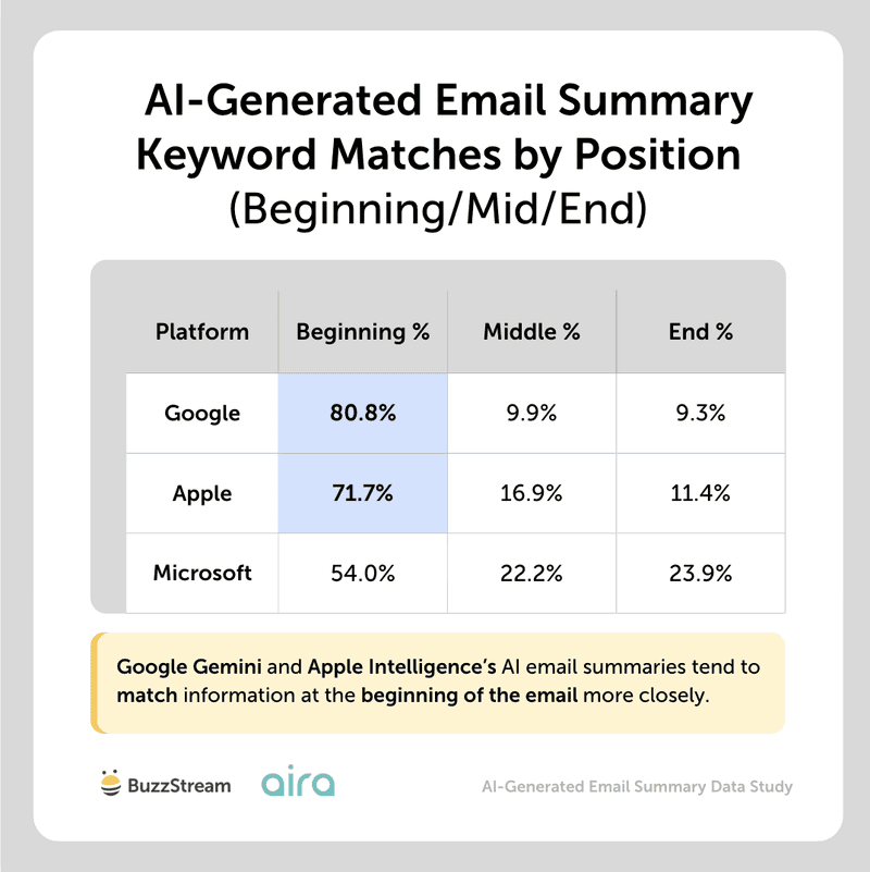
(Copilot’s AI-generated longer average summary length may be one reason why their summaries generate a more balanced summary, pulling info from the beginning, middle, and end of emails.)
There have been many studies showing that AI tools like ChatGPT are more likely to pull information from the beginning of a page. This seems to be a similar trend with AI email summaries.
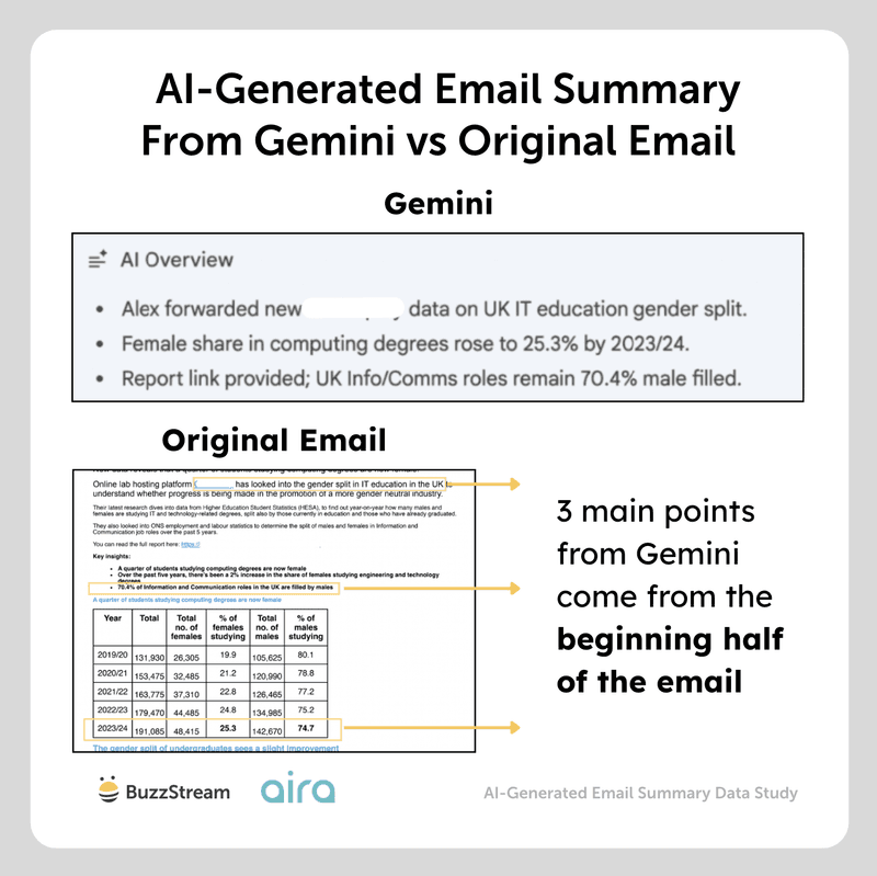
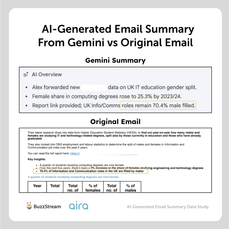
For example, when comparing our original pitch, which is 823 words long, to the Gemini summary, we can see that all three of the major points highlighted in the AI summary are from the first half of the email.
Even without AI summaries, I’d argue that you should always put the most important information first anyway, so if anything, this just gives another reason to.
Expert Opinions
Earn their attention with a clear, concise, relevant pitch.

Head of Digital PR, Aira
Journalists are sifting through hundreds of pitches a day, so you’ve got a few seconds – if that – to earn their attention.
It’s always been crucial for PRs to get to the point right at the top of an email, so the journalist can easily see who, what and why – including why it’s relevant right now. That way a journalist knows what’s on offer from a quick scan.
Journalists’ time is now even shorter, due to reduced editorial teams and increased competition in the PR/earned media space, resulting in more emails to sift through. Therefore they might start relying on AI summaries to give them an even briefer overview, to see if they might be interested. So this finding makes it even more essential to structure your emails in the right way – so whether journalists are scanning the emails themselves or using AI, they get the who, what, why quickly and easily.
The supporting detail can sit further down, where a journalist who’s already interested will go looking for it.
Two additional key pieces of advice:
- Once you’ve written the opening section, sense check it with someone to make sure they easily understand the why, and what story you’re selling.
- Make sure the rest of your email then flows with the opening and topic theme – ensure there’s no information/data which could be confusing/contradict opening statements, as despite this being further down, it could still confuse the AI summary.
Ultimately, clarity at the top is what turns a good story into actual coverage.
Next, let’s look at the impact of subject lines.
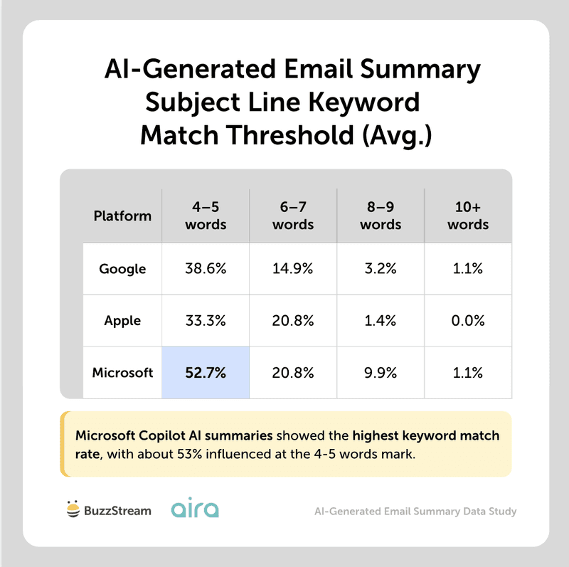
4. Do Email Subject Lines Influence the AI-Generated Email Summary?
Subject lines partially influence the AI-generated email summary, affecting only about 2 in 5 AI-generated summaries for Google and Apple.
However, this rises to over three in five for Microsoft Copilot, so there is definitely more influence there.
(When comparing, we looked at matches above 4 keywords, as we thought this was the fairest to represent the subject line influencing the summary, rather than the email itself.)
Though the platforms varied, Microsoft Copilot showed the highest subject-line keyword match rate across the board, with the most matches at 4-5.
However, some keywords that digital PRs tend to use in subject lines appear more frequently in email summaries.
We bucketed the specific keywords to show their impact.
Overall, certain keywords like “new”, “data”, “expert quote”, and the position of the expert get pulled more frequently into AI-generated summaries when used in the subject line.
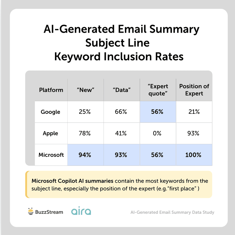
As you can see, Microsoft Copilot tends to pull “new”, “data”, and the expert’s position from the subject line into its summary almost all the time.
It is wild how different some of these platforms act, but we know from other studies we’ve done, like our AI citation study, that you really need to look at AI from a platform-to-platform perspective, rather than as a whole.
Similarly, we ran a large study on subject line performance, and “data reveals” was one of the top-performing hooks.
So, I do think there’s a reason that AI technology takes note of those kinds of keywords.
It’s important to note that we couldn’t fully isolate the keywords coming from the subject line from the body copy, but we also compared keyword inclusion in summaries between emails sent with the keyword in the subject line vs not to try to get as close as we could to understand where the inclusion was coming from.
Next, we are going to dig into the composition of the email pitches themselves, starting with the impact of email personalization on AI summaries.
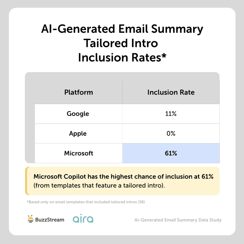
5. Do Personalized Intros Within an Email Body Influence AI-Generated Email Summaries?
Personalized or tailored intros only seem to influence summaries generated by Microsoft Copilot at 61%, while Google shows only 11% inclusion.
To clarify, when we talk about personalized or tailored intros, we mean referencing previous articles:
“I read your previous article on the new EPC rules for landlords and thought you might be interested in some new research as a follow-up or addition to your story.”
Or:
“Following on from your recent study on teaching finance in schools, I thought additional data on the best states of financial literacy would be of interest.”
To uncover this, we looked at inclusion of tailored summaries, specifically inclusion of keywords like “your recent article”, ”your article” “you covered”, “your readers”, “article” or “coverage” used in the correct context, or about the article we highlighted.
Apple Intelligence’s summaries were completely unaffected by any tailored intros.
Using customized intros in outreach to journalists can be somewhat controversial in the digital PR space, with some staunchly opposed to it (as it can sometimes feel forced).
We’ve covered email personalization techniques at length, and I personally believe they are only effective when you have a really strong hook to a prior piece of coverage.
So, the fact that they don’t necessarily impact anything might be another reason to skip.
Next, let’s look at a mainstay in the media pitch email: bolded text.
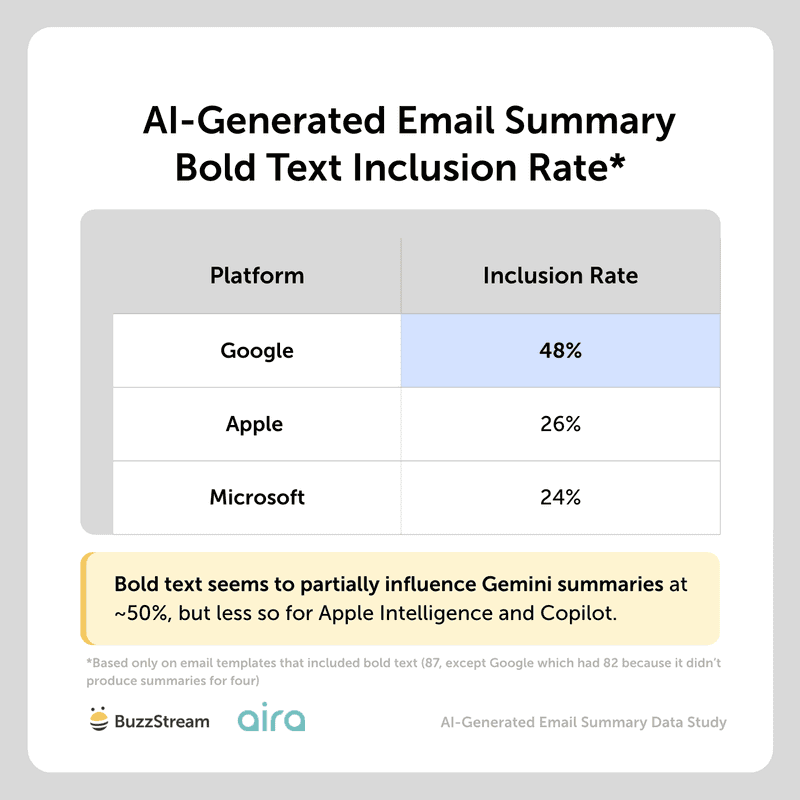
6. Does Bold Text Within the Email Body Influence the AI-Generated Email Summary?
Bold text somewhat influences Gemini AI-generated email summaries at a 48% inclusion rate, but only 1 in 4 summaries for Apple Intelligence and Copilot.
We also compared against “non-bold” versions to determine whether the text in the email summary was still pulled through.
Most importantly, most of the email summaries that featured bold text pulled from the email’s key point, which typically came early in the email.
For example, in the image below, you can see the original email vs the AI-generated email summary from Gemini, calling out one of the bolded items:
However, it’s important to note that these AI platforms most likely aren’t pulling the text here just because it is bold.
It’s most likely because these AI platforms are more prone to pulling information from the beginning of emails.
Additionally, it could also be because the bold text tended to come from bullet points, which you’ll see in the next section.
Next, we wanted to see if these platforms behaved the same way with bulleted text.
7. Does Bulleted Text Within the Email Body Influence the AI-Generated Email Summary?
Across all three platforms, bulleted text appears to influence what is included in AI summaries, occurring at least 64% of the time.
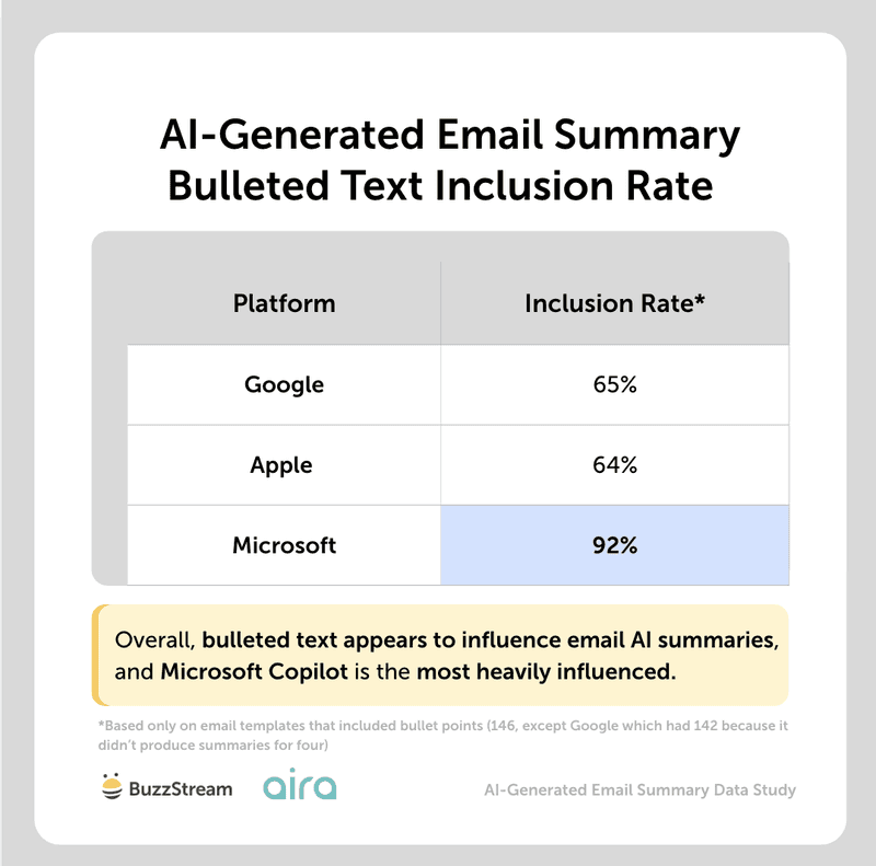
Microsoft Copilot was the most heavily influenced, with a 92% inclusion rate, and Apple was the least, at 64%.
This may be because Copilot simply has more space in its summaries (remember, it includes ~150 words on average).
Google appears to feature the first bullet point more often than any other at 69% (vs 15-33% inclusion for bullets 2-4).
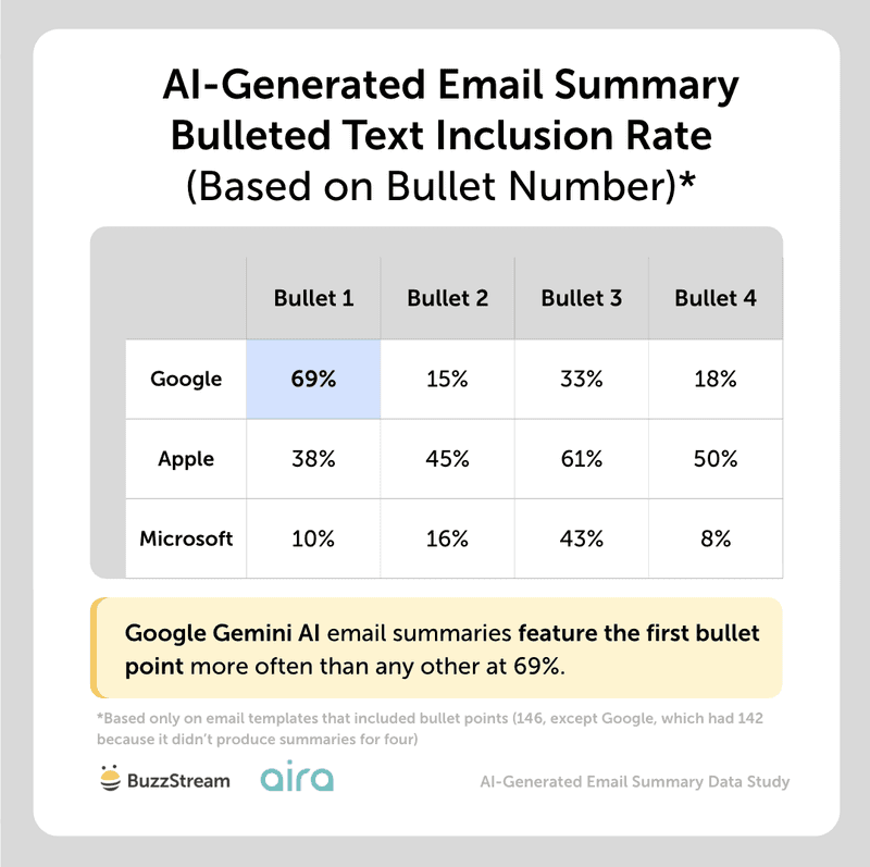
However, on both Apple and Microsoft, there doesn’t appear to be a preference for which bullet points are included in the order they appear.
As in the bold text, we compared inclusion rates between templates with and without bullet points to sense-check the effect.
Again, the inclusion of bullet points could also be influenced by email summaries that draw most of their information from the top sections of the email.
Expert Opinions
Bullet points have always been useful for pitch emails.
Head of Digital PR, Aira
Bullet points have always been useful for pitch emails. They break up a wall of text and let a busy journalist scan the key facts from your story quickly. Typically used after the who, what, why, they give a few key points on what the story, expert or data is showing to help further engage the journalist and encourage them to read on.
But if journalists are starting to lean on AI summaries to help speed up reviewing inboxes – and at least 64% of AI summaries are influenced by bullet points – bullet points are doing more work than ever. So whilst bullet points used to be a nicety for human readers, they’re now actively shaping what AI flags as the important points of your pitch.
That makes carefully selecting and writing your bullet points crucial:
- Make sure you lead with your strongest data or information – think about what the journalist would be most interested in
- Select data or information that helps sum up your overall story
- Make sure they’re phrased really clearly so they can’t be confused or misinterpreted
Ultimately, if AI is doing the first read of your email for a journalist, your bullet points are doing the first selling for you.
Next, let’s look at how AI summaries utilize information in tables.
8. Do Tables Within the Email Body Influence the AI-Generated Email Summary?
Tables partially affect the AI-generated email summaries, with Microsoft at about 50% inclusion rate and Apple at the lowest at 19%.
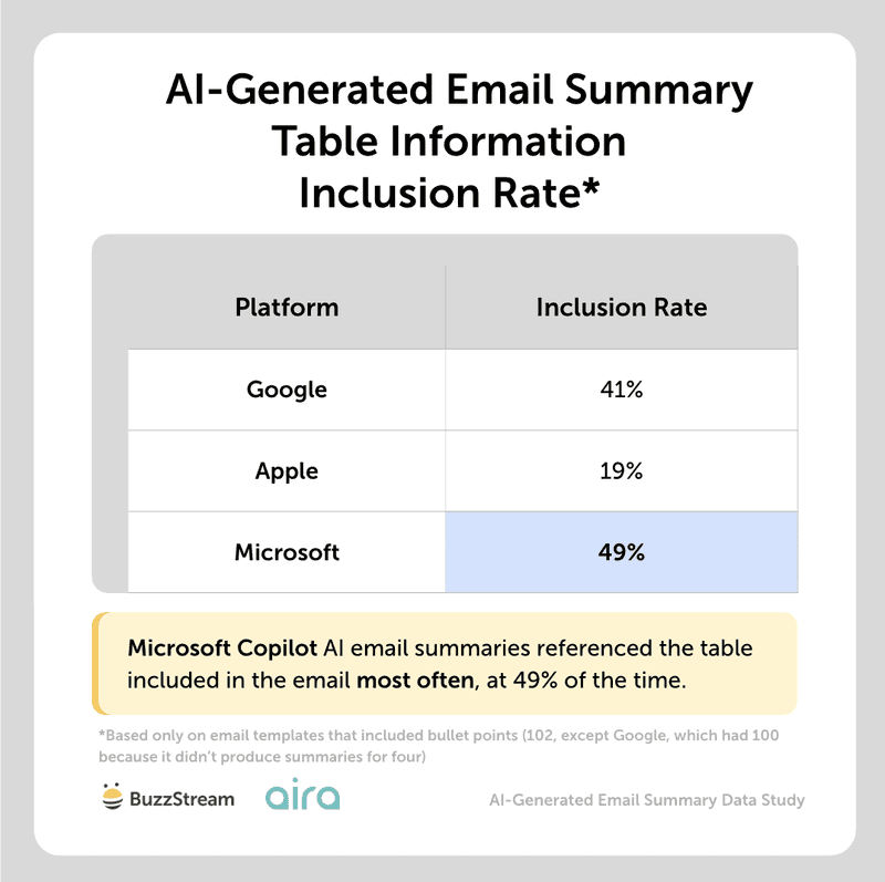
Just as with the bullets, one reason Microsoft included table information may simply be that Copilot’s email summaries are longer.
Overall, it seems like AI understands the information rather than just haphazardly pulling things from a table.
Most of the email summary inclusions were from the top or bottom of the table, representing the best x, or, from the bottom, the most recent data (since it was ordered from oldest to newest).
In the example below, you can see the included table starts with contact info, identifiers, and usage data as the most collected data linked to user:
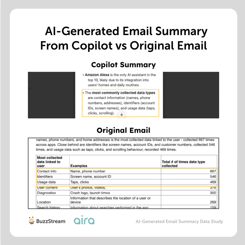
In the AI summary from Copilot, we can clearly see those top three mentioned in the third bullet.
This is somewhat surprising, because I read a study by Mersel AI that found certain AI platforms prefer information in tables because it is easier and faster to read.
Next, we’ll look at graphics and attachments.
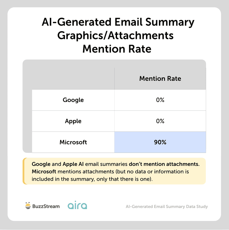
9. Do Graphics or Attachments Influence the Email Summary?
None of the platforms is meaningfully influenced by graphics/attachments. Copilot mentioned attachments/graphics 90% of the time, but when it did, it was just that there was an attachment, not any information from the graphic itself.
Google and Apple email summaries aren’t at all influenced by information on graphics or attachments, and it seems like they cannot even read these (yet).
In general, graphic analysis is more costly than text analysis, which may limit a feature like AI summaries across all platforms.
In our study of image use when pitching journalists, we didn’t notice a noticeable difference in reply or open rates, but that doesn’t mean they are useless.
In product PR, for instance, they are a necessity. If your pitch includes a map or other visuals that help convey the information more effectively, it can be beneficial as well.
Next, we’ll look at the mention of hyperlinks included in an email.
10. Does Including Links (Client Content, LinkedIn, About Us Page) Influence the Email AI-Generated Summary?
Including links to client content appears to affect only Microsoft Copilot summaries.
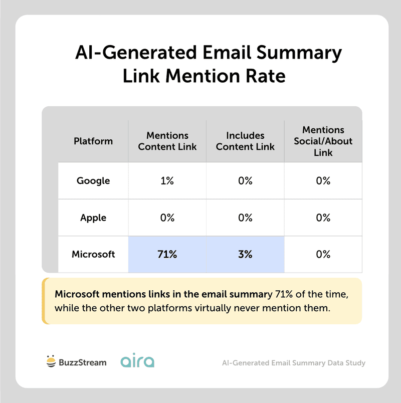
Copilot mentioned links in 71% of the summaries for emails that featured a campaign link.
These links were referenced in different ways, from “to download full press release, data set and visuals” (even though not linking to a press release, but live campaign content), to “full report and methodology” or “full dataset”, but Copilot only extracted the full link 3% of the time.
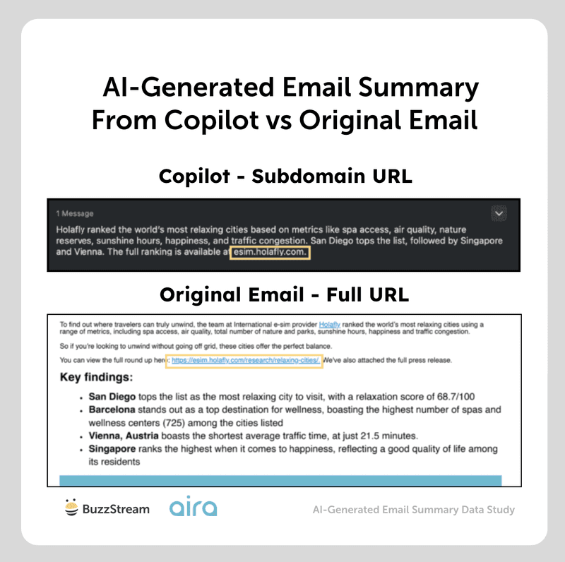
Sometimes, we saw partial links mentioned.
For instance, in the original email, we mentioned a link to https://esmin.holafly.com/research/relaxing-cities, but Apple Intelligence shortened and mentioned the subdomain rather than the entire URL:
Furthermore, in about 5% of cases, some of the data in Copilot summaries was not included in the email, suggesting the AI visited the link and added extra information on occasion.
When asking the Aira team why this may be the case, they said:
“Microsoft 365 Copilot has a ‘web search’ capability that means it can ground responses in data and information collected via Bing – unless switched off at organisation or group level.
Essentially, Copilot can generate a search query and use web results to improve its response.
It appears, from the study findings, that this could include the link to your campaign content if in the email. So it could search that URL, and then pull information from that content to “improve” its response.
Web grounding could kick in if specific phrasing is used to highlight that the full story, or more data, is available at the link, as this implies that the meaningful content lives at the destination. But we’re yet to test this.”
Expert Opinions
Links don’t influence AI email summaries — but they still matter after the summary does its job.
Head of Digital PR, Aira
Whilst our research found that links don’t really influence AI email summaries, that doesn’t mean they’ve lost their job.
If the AI summary catches a journalist’s attention, and your pitch email keeps them engaged and interested, the link is what they’ll likely click on next. So they’re still doing the work of helping turn interest into action – whether that’s checking an expert, or accessing the full campaign for more data or insight.
We see links to expert profiles, whether on LinkedIn or ‘About us’ pages, as crucial for including in pitches. In today’s world where AI-produced experts are rife, they’re key to quickly showing a journalist that your expert is real, and to help show their expertise. You’re saving a journalist time by giving them the extra sources to verify the expert.
This proactivity might also help get the expert on the journalist’s radar for future commentary opportunities.
OK, lastly, we wanted to get to the more important piece of these studies: the misrepresentation of data.
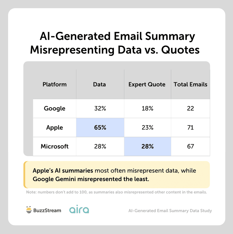
11. How Frequently Do AI-Generated Email Summaries Misrepresent Data or Content?
AI-generated email summaries misrepresented data or information from the original in about one in three emails.
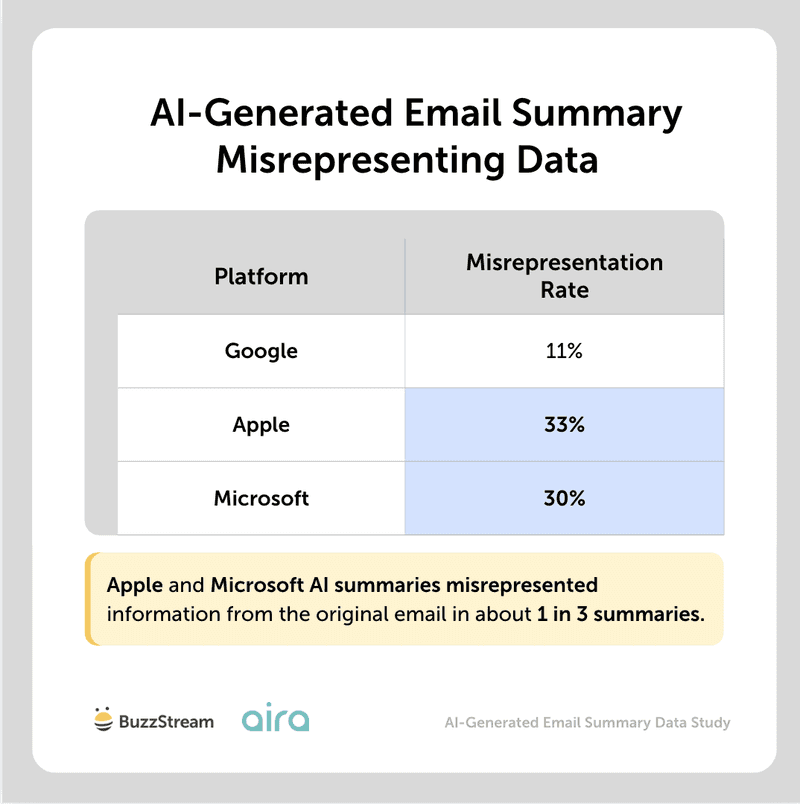
Apple was the biggest culprit at 33%, followed by Microsoft at 30% and Google at 11%.
When we looked at the types of information misrepresented, it was mainly data-related, with Apple misrepresenting data more often than the other platforms.
For instance, in one of the original emails, the quote was to keep your car “as charged as possible”.
But in the AI-generated summary, it says “charging to 40-80%,” which, while it may seem like a small difference, is not the same thing.
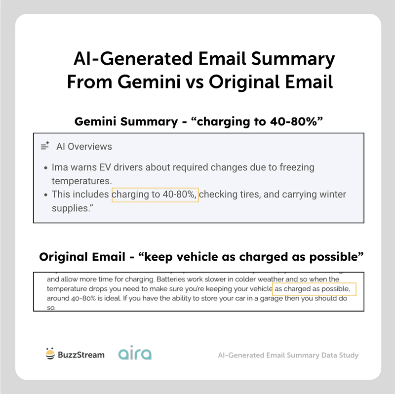
Obviously, this misrepresentation can be problematic if a journalist is not taking the time to double-check the facts.
Or in the case of a city index study, the summary from Apple Intelligence misinterpreted the findings by overgeneralizing, saying the Bexley, Crawley, and Reading ranked the worst due to limited specialist clinics and below-average GP coverage:
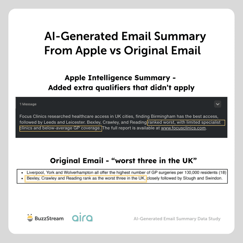
As you can see in the original email, all three were ranked the worst, but it didn’t specifically say anywhere in the email that they ranked worst due to “limited specialist clinics” and “below-average GP coverage.”
Expert Opinions
Although there’s a very low likelihood that a journalist would rely solely on the AI-generated summary for data and figures, it’s always a good idea to double-check after publication.
Head of Digital PR, Aira
Data and expert insight have always been the backbone of a strong digital PR story, and therefore the pitch. It’s the meat behind the story, the “something new” and therefore the reason a journalist will cover it.
But with AI summaries misrepresenting data, information or expert advice in up to one in three emails, this could put the chances of coverage – or even in extreme cases your expert’s reputation – in question. We wouldn’t expect that journalists rely on the AI summary alone for figures or expert advice, but it can still shape their first impression.
That makes how you present data, information and expert commentary crucial:
- Keep key points clear, simple and self-contained – don’t layer in comparisons or combine data or tips. This helps to avoid misrepresentation
- Make the meaning of the figure obvious in the same line – a number without context is the easiest thing for AI to misread
- Try not to include multiple data sets or sections which are only slightly differentiated without clarification e.g. figures for computing undergraduates, and ‘computing studies’ students. If they’re similar, but slightly different, and the differentiation isn’t clarified, this is the kind of thing AI will struggle to interpret in the right way.
- Sense check by asking: if someone only read this one section – or the whole email – would they walk away with the right interpretation?
Once coverage goes live, it’s worth double-checking the published piece against your original data to make sure no misinterpretations from AI have crept in.
Ultimately, you can’t control AI summaries, but you can give AI the best chance of interpreting your emails in the right way.
With all of that data, let’s recap everything we’ve learned.
Recap: What Have We Learned?
First off, a big shout-out to Head of Digital PR Chloe Osunsami, Digital PR Lead Alex Fiske, and Senior Digital PR Specialist Laura Brothers, all from Aira, who helped me compile all of this.
At this point, AI summaries appear to be a lightweight version of tools like Gemini and ChatGPT, without many of the bells and whistles, such as image recognition.
They also seem to have strict length cut-offs, which can be extremely limiting for longer media pitches.
There’s no data on the use of email AI summaries by journalists (yet), but I’d imagine it’s not something many journalists would rely on solely to determine if they’re interested in covering.
Most journalists I’ve spoken to rely on subject lines (not AI summaries) when deciding whether to keep or delete/ignore a pitch.
But there are a fair number of best practices that this data reinforced.
For digital PRs and link builders, the practical advice is fairly simple:
- Put the most important information at the top of the email.
- Use clear, simple language around key stats and claims.
- Include 2–3 strong bullets, with the best point first.
- Do not bury essential data in tables, attachments, or graphics.
- Use subject line terms like “new,” “data,” or “expert” when genuinely relevant.
- Assume links may be mentioned, but not reliably or accurately.
- Double-check coverage for any AI-driven misinterpretation of stats and information.
With these in mind, you should be well on your way to better coverage.
Methodology
We ran 13 digital PR campaigns and created 4-11 outreach email templates for each. The different templates focused on changing one element at a time so we could test how each change affected email summaries.
The changes included updates to the subject line, key bold points, bullet points, tables, tailored introductions, graphics, press releases, links to full campaign content, and links to expert LinkedIn profiles or about us pages.
Each email template was sent to two email addresses at each of the three key email providers – Google, Apple, and Microsoft – so we could also see if the same email provider produced different email summaries for the same outreach email. All email summaries were recorded at the time of receiving them.
The email summaries were then analyzed using a number of research questions to determine the key factors influencing them and whether they accurately represented the outreach emails. Claude AI was used for part of the analysis, but methodology and raw data outputs were manually reviewed to determine the validity of the conclusions. All email summaries were also manually reviewed for a large number of the research questions including whether bold key points, bullets and tables influenced the email summaries, and if the email summary misrepresented the email.
Data collected and analyzed in March and April 2026.

 Check out the BuzzStream Podcast