 End-to-end outreach workflow




Table of Contents
- Give away the ending: subject lines that state the finding outperform those that tease it.
- Name the fact, not merely the topic.
- Front-load the news.
- Use clean, intuitive ratios such as “1 in 5″ over percentages.
- Overall, help journalists judge the story’s value at a glance.
Our last subject line study counted the parts of a good pitch: how many words, how many characters, whether it used brackets, whether it was title case.
It tells you how to assemble a subject line, not how to deliver the news inside it.
So we went back to the data with a different question:
Not “What does a subject line contain?” but “What is it doing?”
Across roughly 148,000 real digital PR pitches across 39 million emails (with link-building and commentary-only outreach stripped out so we’re looking at genuine story pitches), four delivery decisions separated the emails journalists opened from the ones they ignored.
Here’s what we found, in the order that matters.
Should you tell journalists the finding, or tease it?
Telling gets better open rates (43.1%) and reply rates (1.37%) than baiting (39.8% open rates) and 0.88% (reply rate).
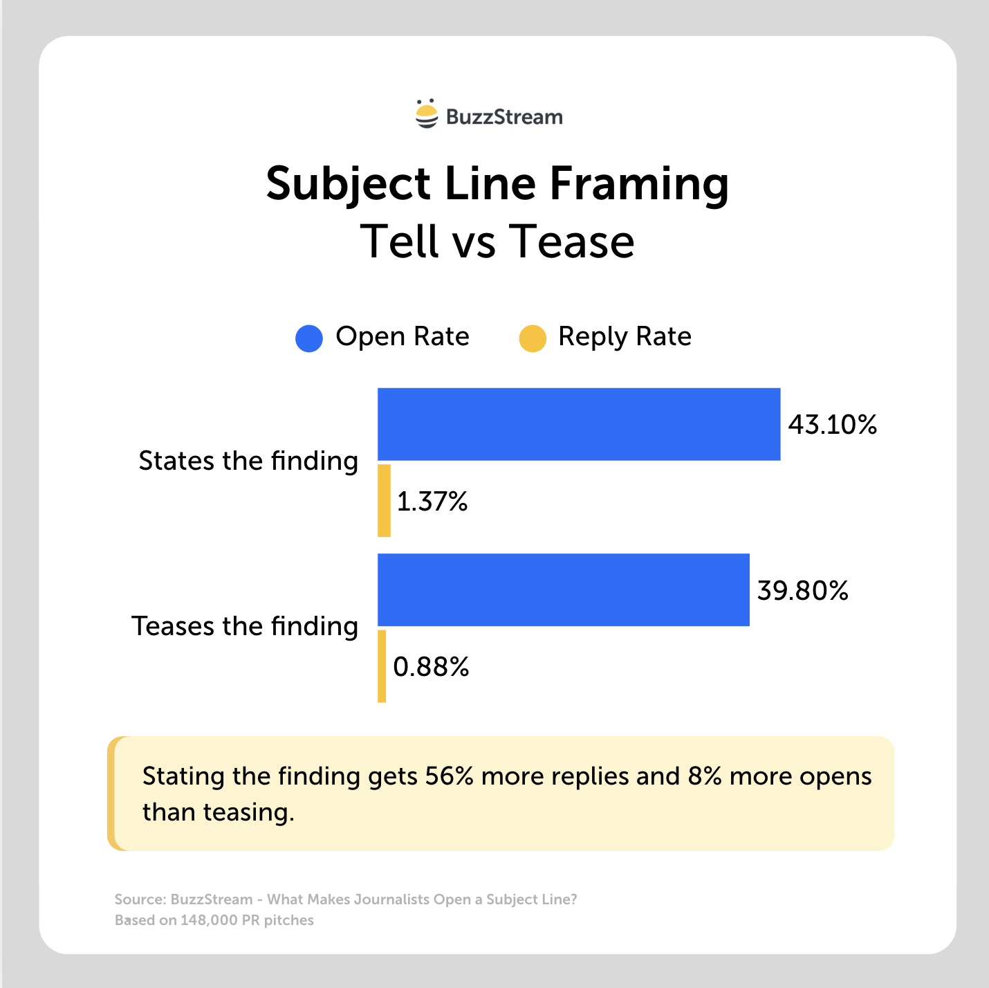
Here it is in table format:
| Framing | Subject lines | Open rate | Reply rate |
|---|---|---|---|
| Tell — states the finding | 54,935 | 43.1% | 1.37% |
| Bait — teases or asks | 5,365 | 39.8% | 0.88% |
This goes against longstanding marketing lore that your subject line should inspire a curiosity gap.
For journalists and digital PR, it appears the opposite is true.
Here’s the bait vs. tell side by side:
| Tease — makes them dig for it | Tell — hands it over |
|---|---|
| Ranked #8 Regionally: What Sets Philadelphia Apart as a College Town in 2025? | 1 in 5 American Homeowners Has Experienced a Flood |
| Where does Anfield rank in the safest Premier League stadiums table? | $507 is How Much First-Time Homebuyers Are Advised to Spend on New Plumbing |
| What are Johnny’s chances of winning the 2024 tournament? | 50% of Americans Say Their Smart Lights Prevented a Recent Break-in |
The clearest repeat offender is the question — posing your finding as ‘Is X the worst state for Y?’ instead of stating it. (Questions open at 37.5%, below the 39.5% baseline, and have the worst reply rate.)
The reason is simple once you picture a journalist’s inbox: they are tasked with sorting through hundreds of emails for a usable, relevant story.
Giving them a line that hands over the finding lets them judge it instantly.
Takeaway: Give away the ending.
What’s better: a specific or a broad subject line?
Specific subject lines drastically outperformed vague ones with about 24% higher open rates (43% vs 34.6%).
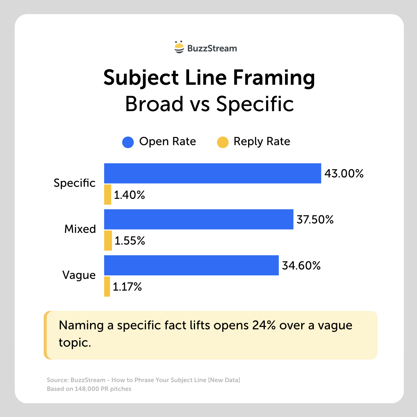
Here it is in table format:
| Concreteness | Open rate | Reply rate |
|---|---|---|
| Concrete — names the specific thing | 43.0% | 1.40% |
| Mixed | 37.5% | 1.55% |
| Vague — a category, not a finding | 34.6% | 1.17% |
To help this one, let’s look at some examples:
| Vague — names a topic | Concrete — names the finding |
|---|---|
| The airport businesses you should avoid during this holiday period | Fortune Exclusive: 1 in 4 American Homeowners Has Experienced a Flood |
| Leeds ranks amongst the best cities to be a landlord in the UK | Top Tech Support Issue in Texas |
| Yorkshire’s biggest money worries revealed by new survey | 67% of Americans Say Their Smart Lights Prevented a Recent Break-in |
However, about half of the subject lines in our dataset were in that middle “mixed” territory.
And I define that mixed group by doing one concrete thing but stop short of a crisp, quantified finding.
They name a real place but attach a soft superlative (“one of the noisiest”), or they include a number that’s really a listicle count (“the 10 most productive cities”), or they name a specific subject but withhold the actual figure.
Here are a few amended examples from the data, and how I’d sharpen them:
| Mixed — one foot there | Why it’s only “mixed” | Pushed to concrete |
|---|---|---|
| Birmingham ranks as one of the most beer-obsessed cities in the UK | Names a place, but “one of the most” is a soft claim | Birmingham is the UK’s 3rd most beer-obsessed city |
| New study reveals the 10 most productive cities in the world | Has a number, but it’s a list count, not a finding | Singapore is the world’s most productive city, ahead of Tokyo |
| New York named one of the noisiest cities worldwide | Named place, but no figure or rank | NYC hits 74 decibels — the 3rd noisiest city worldwide |
Takeaway: Name the fact, not the topic.
If your line already names a place or a number, make it earn its place: swap “one of the most” for the actual rank, and swap a list count for the single headline finding.
Where in the subject line should the key information go?
The key information should go in the front of your subject line. Putting the key info in the first three words had an open rate of 46% vs 38.1% for words 7+.
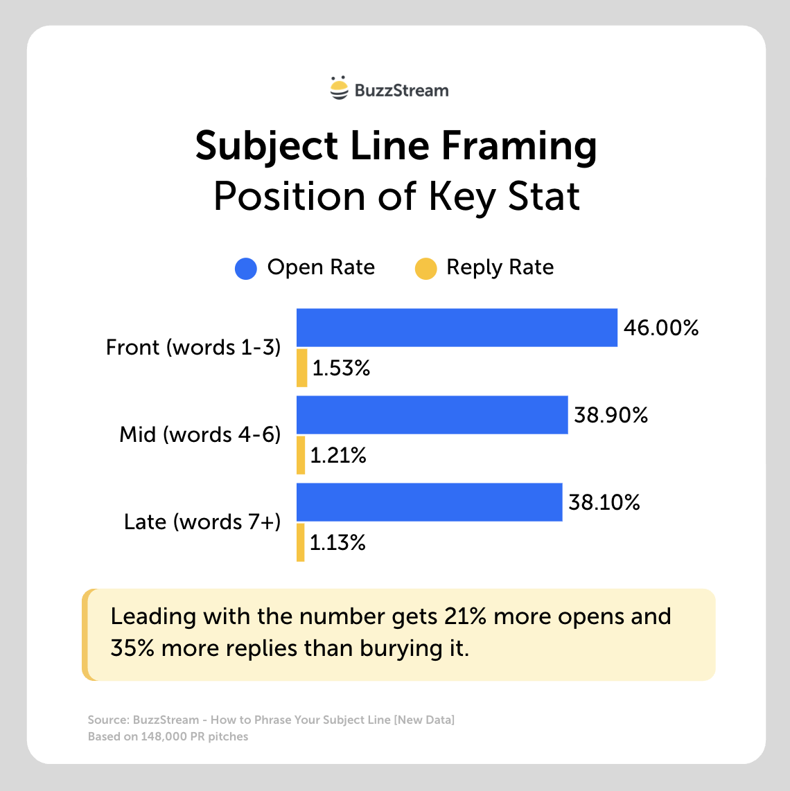
Here it is in table format:
| Position of the first number | Open rate | Reply rate |
|---|---|---|
| Front (words 1–3) | 46.0% | 1.53% |
| Mid (words 4–6) | 38.9% | 1.21% |
| Late (words 7+) | 38.1% | 1.13% |
And by “key info,” I don’t just mean numbers. It should be the most important piece of your story.
For example, a line like “A new survey of remote workers reveals the city they’d most want to leave” buries the actual finding at the end.
Instead, I’d lead with it: “San Francisco is the city remote workers most want to leave, new survey finds.”
Here are some more examples from the dataset of buried vs front-loaded:
| Buried — number arrives late | Front-loaded — number leads |
|---|---|
| Will AI be the future’s business travel planner? Expedia.com reveals 2025’s trends | $405 is How Much First-Time Homeowners Are Advised to Spend on New Locks |
| Best San Fran Zip Codes That Could Save Renters Up to $900 on Homes | 1 in 6 Have Stopped a Thief with a Video Doorbell |
| Philadelphia Attracts Plenty of Renter Interest In Off-Season, Ranks 6th Nationally | Security Cameras 2x As Effective as Alarm Systems, New Data Shows |
What causes these front-loaded subject lines to perform better?
My best guess is that because subject lines are cut off by email platforms due to display sizes.
Desktop Gmail shows around 14 words of a subject line; mobile about six.
(I covered this a bit in my email subject line length checker study.)
Takeaway: Lead with the number or the named thing. Everything a journalist needs to judge the story should survive being cut off at six words.
Should you use a ratio vs percentage in a subject line?
Ratios performed best, opening at 48.8%, while percentages performed worst at 42.3%.
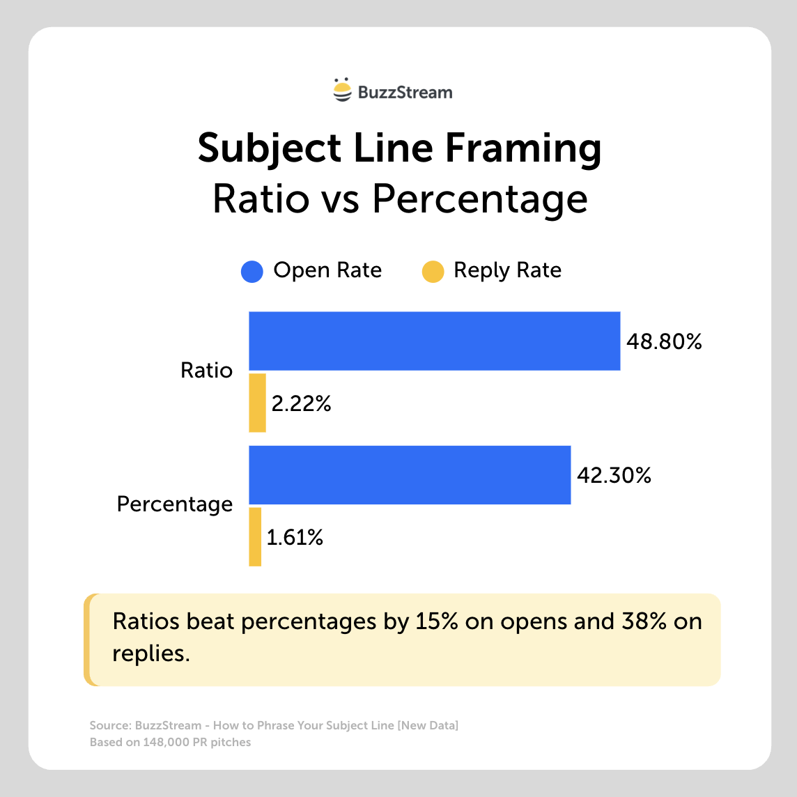
Here it is in table format:
| Number format | Example | Open rate | Reply rate |
|---|---|---|---|
| Ratio | “1 in 5” | 48.8% | 2.22% |
| Percentage | “54%” | 42.3% | 1.61% |
“1 in 5” is something a journalist can immediately visualize.
“54%” is a statistic they have to interpret.
Here are some examples side by side:
| Percentage format | Ratio format |
|---|---|
| Study: 71% of investors are interested in tech and AI investments | 1 in 2 renters have delayed moving because of hidden fees, new study |
| 44% of hiring managers say they’d rehire a former employee, survey finds | 1 in 4 small business owners report their romantic life has suffered [study] |
| 80% of commuters say they’d switch jobs for a shorter drive, new data shows | 1 in 5 homeowners have downsized to prepare for a recession [study] |
| More than 25% of city residents plan to relocate within a year, survey finds | Over 1 in 4 freelancers are unhappy with their work-life balance |
However, you can’t just replace any percentage with a ratio; the denominator seems to matter.
The nuance: only clean ratios beat percentages
Clean ratios like “1 in 4” or “2 in 5” had about 49% open rates while the more awkward bases performed 45.5%.
Once you get to something like “1 in 20,” it actually falls below a plain percentage.
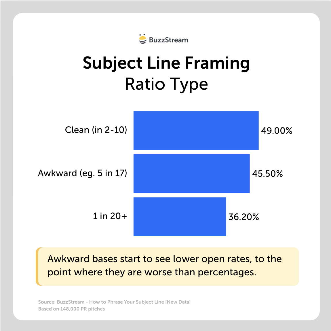
Here it is in table format:
| Ratio type | Example | Open rate |
|---|---|---|
| Clean base (in 2, 3, 4, 5, 10) | “1 in 4”, “2 in 5” | 49.0% |
| Awkward base | “1 in 19”, “5 in 17” | 45.5% |
| “1 in 20”-style | “1 in 20” | 36.2% |
So the rule isn’t “always use a ratio” — it’s “use a ratio a reader can picture in a glance.
If your figure doesn’t reduce to a clean fraction, a familiar percentage is the safer choice.”
Takeaway: A clean ratio beats an abstract percentage. But an awkward ratio is worse than either, so if your stat doesn’t reduce to something like “1 in 5,” keep it as a familiar percentage.
What about matching a journalist’s headline-writing style?
These recommendations fly in the face of prevailing wisdom I’ve heard time and again on our podcast about modeling your subject line after the headline writing style of the journalist you are pitching.
I’m tempted to give a cop out recommendation here and say “it depends, or “it can be both.”
So, I’ve also asked some experts in the field.
Madeleine Dykes, Public Relations Account Director, with Rise at Seven (and a former BuzzStream podcast guest), told me:
“When it comes to mimicking a journalist’s or publication’s headline-writing style in your subject lines, I would highly recommend doing that for those publications that are the top of your target list.
However, if you don’t have time to personalize and update your subject line for each contact, I would always recommend making your subject lines as straightforward as possible.”
Alex Fiske, Head of Digital PR with Aira, and also a former podcast guest), told me:
“Journalists are stretched thinner than ever, so anything you can do to reduce their editing time makes your pitch the easy one to say yes to.
If your subject line already sounds like their headline, you’ve done a chunk of the work for them, because they can see exactly where the story slots in without having to reshape it.
Matching their format also signals that you’ve actually read their work, not just scraped their email address off a database.
It shows you’ve researched the specific journalist you’re pitching and that you’re trying to build a genuine relationship, with that goodwill hopefully paying off well beyond a single story.
Most of all, mirroring how they write lets them picture the piece as if the data were their own.
When the framing already fits their voice, the story feels half-written before they’ve even replied, and that’s often the difference between a pitch that lands and one that gets left on read.”
At the end of the day, I think the best answer here is to err on the side of clarity, brevity, and relevancy.
Whatever you can do to stand out in a crowded inbox and give the journalist the ability to make the call at a glance.
Methodology
We analyzed roughly 148,000 digital PR subject lines with recorded open rates.
Before the analysis, we removed link-building type outreach (guest posts, link insertions, article-update requests) and pitches whose primary purpose was offering expert commentary rather than a story, so the results reflect genuine media pitches.
Concreteness, bait-vs-tell, and campaign type were coded with classifiers developed from a hand-scored sample and validated for directional accuracy; front-loading and number format key off literal features (the position of the first digit, the presence of currency symbols or ratio patterns) and are the most precisely measured of the set.
Roughly half of all lines could be confidently assigned a campaign type from their campaign names; the type breakdowns describe that classifiable half.


 Check out the BuzzStream Podcast